Interior paint design ideas transform ordinary rooms into personalized spaces that reflect your style and enhance your home’s atmosphere.
The best approaches combine color psychology, creative techniques like accent walls and two-tone designs, and practical considerations such as room size and natural lighting.
Popular interior paint design ideas include using the 60-30-10 color rule for balanced schemes, incorporating nature-inspired palettes with greens and earth tones, and experimenting with bold geometric patterns or ombre effects.
Whether you prefer calming neutrals, dramatic dark hues, or vibrant statement walls, choosing the right interior paint design ideas involves understanding how colors affect mood, selecting complementary shades, and applying techniques that suit your room’s function.
From minimalist monochromatic looks to texture-rich finishes, these design strategies help homeowners create cohesive, visually appealing interiors that stand the test of time while expressing individual personality through thoughtful color selection and application methods.
Why Do Interior Paint Design Ideas Matter for Your Home?
Interior paint design ideas play a crucial role in shaping how your home feels and functions. The colors you choose directly impact your mood, energy levels, and even how spacious a room appears. Research shows that color psychology influences emotions, with cool blues promoting calmness while warm yellows encourage happiness and creativity.
Beyond aesthetics, interior paint design ideas affect your property value. Homes with modern, well-coordinated color schemes attract buyers and can increase resale prices by up to 10%. Professional painting choices signal care and maintenance, making your space more appealing.
Room functionality changes based on your color selections. Kitchens painted in warm tones like terracotta or soft peach stimulate appetite and conversation. Bedrooms benefit from soothing shades such as lavender or sage green that promote restful sleep. Home offices work best with focused colors like navy blue or forest green that enhance concentration.
Natural lighting interacts with paint colors throughout the day. North-facing rooms with limited sunlight need warmer hues to feel inviting, while south-facing spaces can handle cooler tones without feeling cold. Testing paint samples at different times helps you understand how light affects your chosen interior paint design ideas.
The right paint transforms small spaces into seemingly larger areas. Light colors reflect more light, making cramped rooms feel open and airy. Conversely, dark colors create cozy, intimate atmospheres in oversized rooms that might otherwise feel empty.
Your home’s architectural features shine when you select complementary colors. Crown molding, wainscoting, and trim pop against contrasting wall colors. Interior painting services can help highlight these details through strategic color placement.
Key Benefits of Thoughtful Paint Design:
- Enhances mood and mental wellbeing
- Increases home value and marketability
- Defines room purpose and functionality
- Optimizes natural and artificial lighting
- Highlights architectural details
- Creates visual flow between spaces
- Reflects personal style and taste
Which Color Is Best for Interior Paint?
Choosing the best color for interior paint depends on several factors including room purpose, size, lighting conditions, and personal preferences. No single color works universally for all spaces, but certain shades prove popular and versatile across different home styles.
Neutral colors remain the most reliable choice for interior paint design ideas. Shades like warm white, greige (gray-beige blend), and soft taupe provide timeless backdrops that work with various decor styles. These colors create clean canvases that allow furniture and artwork to stand out while maintaining visual calm.
For living areas, warm neutrals like accessible beige or agreeable gray create welcoming environments that encourage conversation and relaxation. These shades adapt to changing natural light throughout the day without appearing drab or cold.
Bedrooms benefit from colors that promote relaxation and sleep. Soft blues reduce heart rate and blood pressure, creating peaceful atmospheres. Light lavenders and muted greens also encourage tranquility. Avoid overly stimulating colors like bright red or orange in sleeping spaces.
Kitchens and dining rooms work well with appetite-stimulating colors. Warm tones like buttery yellow, soft coral, or earthy terracotta create inviting spaces for cooking and gathering. White kitchens remain popular for their clean, bright appearance and timeless appeal.
Bathrooms suit both crisp whites and spa-like colors. Pale aqua, soft seafoam, and light gray create refreshing, clean-feeling spaces. These colors pair well with white fixtures and chrome hardware.
Home offices require focus-enhancing colors. Deep blues and forest greens boost productivity and concentration without causing eye strain. These colors create professional atmospheres suitable for video calls and focused work.
Consider your home’s overall flow when selecting colors. Choosing a cohesive palette that connects rooms creates visual harmony. Use varying shades of the same color family or complementary colors that transition smoothly from space to space.
Popular Interior Paint Colors by Room:
| Room Type | Best Color Choices | Why They Work |
| Living Room | Warm gray, beige, soft blue | Versatile, calming, adaptable |
| Bedroom | Pale blue, lavender, sage green | Promotes relaxation and sleep |
| Kitchen | White, soft yellow, light gray | Clean, bright, welcoming |
| Bathroom | Aqua, seafoam, crisp white | Fresh, spa-like atmosphere |
| Home Office | Navy blue, forest green, charcoal | Enhances focus and productivity |
Working with professional painters in Winnipeg ensures your color choices translate well from sample to finished walls. Experts understand how different paint finishes and lighting conditions affect final results.
What Is the 3 Color Rule in Interior Design?
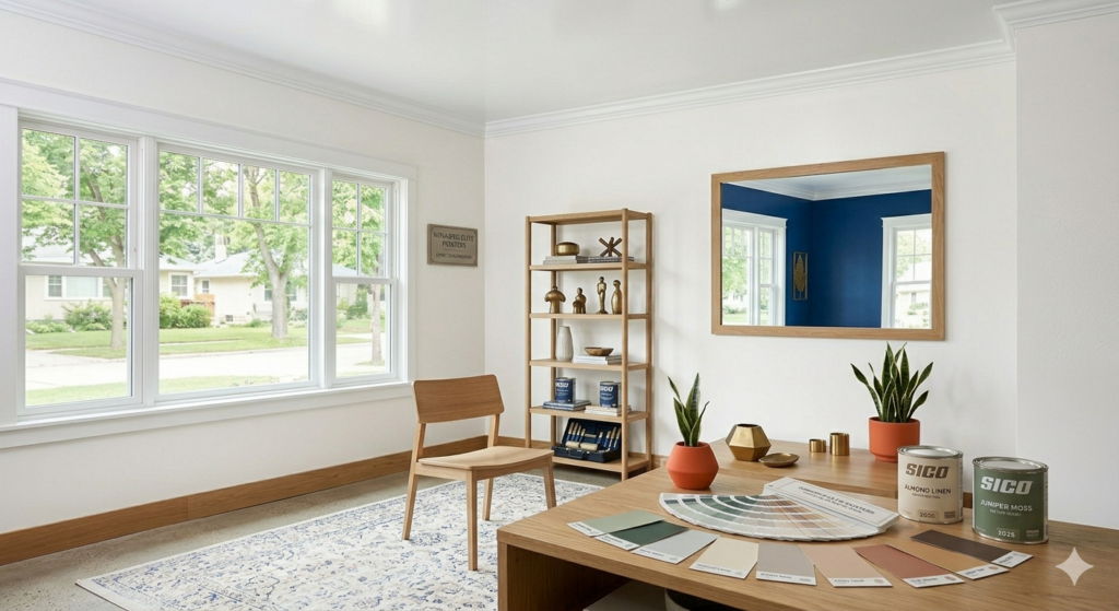
The 3 color rule, also known as the 60-30-10 rule, provides a balanced approach to interior paint design ideas that creates visually harmonious spaces. This principle guides how you distribute colors throughout a room to achieve professional-looking results without overwhelming the senses.
The dominant color occupies 60% of your space. This primary shade typically covers walls and large furniture pieces. Choose neutrals or subtle colors for this dominant role, as these shades won’t tire your eyes over time. Think soft grays, warm beiges, or muted blues that create calm foundations.
Your secondary color fills 30% of the room. This shade appears in upholstery, curtains, rugs, or accent furniture. The secondary color should complement your dominant shade while adding visual interest. If your walls are neutral gray, your secondary color might be soft navy or warm terracotta.
The accent color comprises the final 10% and brings energy to your design. Use bold, vibrant shades for throw pillows, artwork, vases, or small decorative items. This pop of color catches the eye and prevents rooms from feeling flat. Accent colors can change seasonally without requiring major redecorating.
Applying this rule to interior paint design ideas means your wall color serves as the dominant shade in most cases. If you paint walls a soft sage green, choose furniture in cream or tan for your secondary color, then add burnt orange pillows and accessories as accents.
Some variations of this rule work equally well. You might paint three walls in your dominant color and one accent wall in your secondary color, then use your accent color sparingly in decor. This approach adds dimension while maintaining balance.
The 60-30-10 rule prevents common design mistakes like using too many competing colors or creating monotonous spaces. It provides structure while allowing creativity and personal expression.
How to Apply the 60-30-10 Rule:
- Select your dominant neutral color for walls
- Choose a complementary secondary color for larger furnishings
- Pick a bold accent color for small decorative items
- Test colors together using paint samples and fabric swatches
- Adjust ratios slightly based on room size and natural light
- Maintain consistency in color temperature (warm or cool tones)
When implementing this rule, consider hiring Winnipeg interior painting professionals who understand color theory and can help you achieve perfectly balanced results.
What Are the New Interior Colors for 2026?
The new interior colors for 2026 embrace nature-inspired palettes, warm earth tones, and sophisticated neutrals that promote wellness and connection to the environment. These trends reflect growing desires for calming, restorative home environments.
Mossy greens lead 2026 color trends. These muted, sage-like shades bring outdoor tranquility inside while pairing beautifully with natural wood tones and organic textures. Unlike bright emerald greens, these softer versions create peaceful atmospheres without overwhelming spaces.
Warm terracotta and clay colors gain prominence. These earthy reds and oranges add warmth and comfort to rooms while maintaining sophistication. They work particularly well in dining rooms and living spaces where you want to encourage conversation and togetherness.
Creamy whites with warm undertones replace stark, cool whites. These softer neutrals feel inviting rather than clinical, creating cozy backgrounds that work with various design styles. They reflect light beautifully while adding subtle warmth.
Soft blues inspired by water continue trending in 2026. Think misty morning skies and calm ocean waters rather than bright navy or electric blue. These shades promote relaxation and work well in bedrooms and bathrooms.
Rich chocolate browns return to popularity. These deep, sophisticated neutrals add luxury and grounding energy to spaces. They pair exceptionally well with brass fixtures and lighter accent colors.
Dusty rose and blush tones remain popular for creating gentle, nurturing environments. These colors work in bedrooms, nurseries, and reading nooks where you want soft, enveloping atmospheres.
Charcoal grays with warm undertones provide modern alternatives to cool grays. These shades add depth and drama without feeling cold or industrial.
2026 Interior Paint Color Trends:
- Mossy sage and muted greens
- Warm terracotta and clay
- Creamy warm whites
- Soft water-inspired blues
- Rich chocolate browns
- Dusty rose and blush
- Warm charcoal grays
These interior paint design ideas emphasize sustainability and natural materials. Pairing these colors with eco-friendly painting practices creates healthier home environments. True Coat offers environmentally conscious paint options that align with these values.
Color combinations for 2026 focus on creating layers of related tones rather than high contrast. Try pairing mossy green walls with cream trim and terracotta accents. Or combine soft blue with warm gray and touches of dusty rose.
When exploring these new colors, consult with experienced painting companies who stay current with trends and can help you select shades that work with your home’s lighting and existing features.
What Is the Most Popular Paint Color for Interiors?
The most popular paint color for interiors remains warm gray, specifically shades like Agreeable Gray, Repose Gray, and Revere Pewter. These versatile neutrals dominate interior paint design ideas because they work with virtually any decor style, adapt to different lighting conditions, and appeal to broad audiences.
Warm grays contain subtle beige or greige undertones that prevent them from feeling cold or stark. Unlike cool grays with blue undertones, warm grays create inviting atmospheres that feel both modern and timeless. They serve as perfect backdrops for colorful furniture and artwork while maintaining sophistication.
White paint follows closely as the second most popular choice. Crisp whites brighten spaces, make rooms feel larger, and create clean, fresh environments. However, pure white has given way to warmer whites with cream or ivory undertones that feel less institutional.
Beige variants maintain strong popularity, especially in traditional and transitional homes. Modern beiges differ from dated tan colors by incorporating gray undertones, creating sophisticated neutrals that avoid looking outdated.
Soft blues rank among the most beloved colors for bedrooms and bathrooms. Their calming properties and broad appeal make them safe choices for homeowners concerned about resale value.
Warm whites and off-whites work throughout homes because they complement any accent color and style. They reflect natural light beautifully, making them ideal for rooms with limited windows.
Most Popular Interior Paint Colors:
- Warm gray (greige)
- Crisp warm white
- Soft beige with gray undertones
- Pale blue
- Warm off-white
These popular colors succeed because they offer flexibility. You can change decor, furniture, and accents without repainting. They also photograph well, which matters increasingly as people share home images online.
Regional preferences affect color popularity. Winnipeg homeowners often choose colors that combat long winters, selecting warm neutrals that create cozy retreats from cold weather. Understanding local preferences helps when selecting interior paint design ideas that suit your climate.
Popular doesn’t always mean best for your specific home. Consider your personal preferences, existing furnishings, and room characteristics when choosing colors. What works in a magazine might not suit your space.
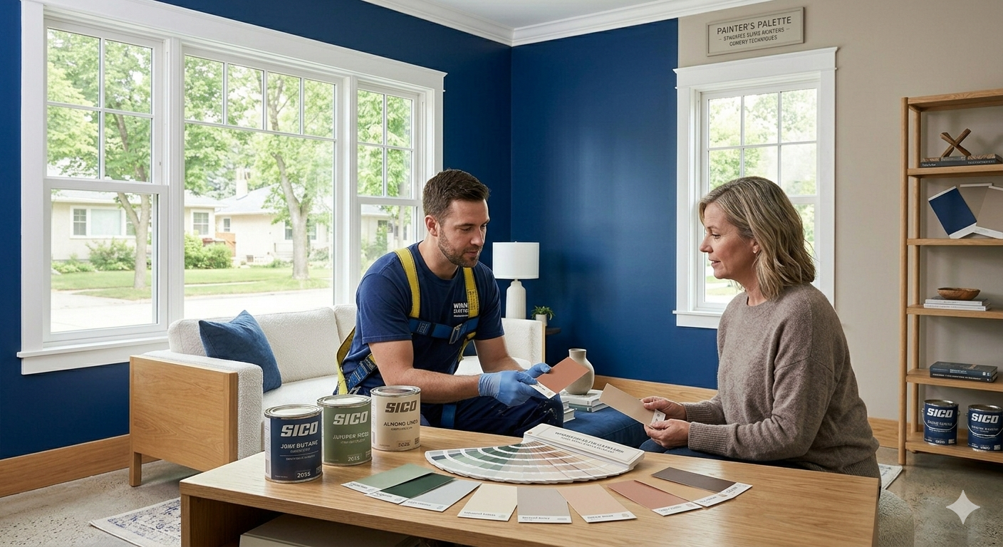
Professional color consultation helps narrow overwhelming choices. True Coat provides expert guidance to help you select colors that match your vision and work practically in your home. For a free estimate on transforming your space with popular paint colors, contact True Coat.
Which 3 Color Combination Is Best?
The best 3 color combinations for interior paint design ideas balance harmony and visual interest while reflecting your personal style. Several proven combinations work across different design aesthetics.
Navy blue, crisp white, and warm gold create sophisticated, timeless spaces. Navy serves as the grounding color for accent walls or cabinetry, white keeps spaces bright and open, while gold adds luxury through light fixtures and accessories. This combination works beautifully in living rooms and dining areas.
Soft gray, blush pink, and brass form a contemporary, elegant palette. Gray walls provide neutral foundations, blush adds warmth and softness through textiles, while brass accents in hardware and lighting introduce glamour. This combination suits bedrooms and modern living spaces.
Forest green, cream, and terracotta deliver earthy, natural vibes. Green creates calming focal points, cream keeps rooms light and airy, while terracotta adds warmth through pillows and pottery. This palette works well in spaces where you want to bring outdoor elements inside.
Charcoal gray, white, and mustard yellow offer modern contrast. Charcoal adds drama and depth, white prevents darkness from overwhelming, while mustard provides energizing pops. This combination suits contemporary homes and home offices.
Soft blue, warm white, and natural wood tones create coastal-inspired or Scandinavian aesthetics. Blue walls or accents promote calm, white brightens spaces, while wood introduces organic warmth. This works in bathrooms, bedrooms, and casual living areas.
Beige, sage green, and black form sophisticated, grounded combinations. Beige walls create warm neutrals, sage adds freshness without being overpowering, while black grounds the scheme through window frames or furniture legs.
Top 3 Color Combinations:
| Primary Color | Secondary Color | Accent Color | Best For |
| Navy blue | White | Gold | Traditional, sophisticated rooms |
| Soft gray | Blush pink | Brass | Modern bedrooms, feminine spaces |
| Forest green | Cream | Terracotta | Nature-inspired, earthy interiors |
| Charcoal | White | Mustard | Contemporary, energetic spaces |
| Soft blue | Warm white | Natural wood | Coastal, Scandinavian styles |
When selecting color combinations, ensure all shades share similar undertones. Mixing warm and cool tones can create discord unless you intentionally desire contrast. Test combinations using large paint samples and fabric swatches before committing.
Consider how natural light affects your chosen combinations. Colors that look perfect in south-facing rooms might appear different in north-facing spaces. Professional painters understand these nuances and can guide your selections.
Your 3 color combination should work throughout connecting spaces for visual flow. You might use your primary color in the living room, secondary in the dining room, and accent touches in both, creating cohesive transitions.
Working with residential painting experts ensures your color combinations translate from inspiration photos to your actual rooms. Professionals help you adapt trendy combinations to suit your home’s unique characteristics.
How Do You Create Accent Walls with Interior Paint Design Ideas?
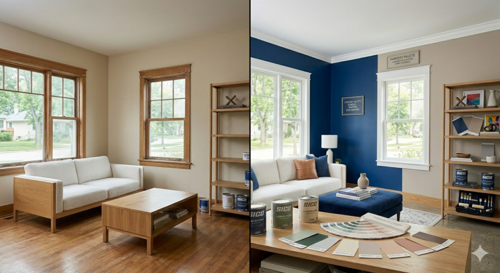
Accent walls rank among the most popular interior paint design ideas for adding drama and personality without overwhelming spaces. These feature walls draw attention to architectural elements or create focal points in otherwise neutral rooms.
Select the right wall for your accent. Choose walls that naturally draw the eye, such as those behind beds, fireplaces, or entertainment centers. Avoid walls with multiple windows or doors that interrupt the visual impact. The wall you see when entering a room often makes the best accent choice.
Color selection determines your accent wall’s success. Choose shades significantly different from your other walls while maintaining harmony with your overall scheme. If your room features soft gray walls, try deep charcoal, navy, or even bold emerald for your accent.
Dark accent colors work in large rooms with ample natural light. They add coziness without making spaces feel cramped. Light accent colors suit smaller rooms where you want to create depth without shrinking the space further.
Texture adds dimension to accent walls beyond simple color. Consider techniques like color washing, sponging, or using textured paints that catch light differently throughout the day. These applications create visual interest without requiring bold colors.
Geometric patterns transform accent walls into artistic statements. Use painter’s tape to create stripes, chevrons, or color blocks. This approach suits modern and contemporary spaces while allowing creativity.
Ombre effects blend colors from dark to light, creating gradient walls that add sophistication. This technique works particularly well in bedrooms and bathrooms where you want calming visual flow.
Accent Wall Ideas:
- Bold single-color feature walls
- Geometric patterns and stripes
- Ombre gradient effects
- Textured finishes
- Wallpaper and paint combinations
- Two-tone horizontal divisions
- Stenciled designs
Paint sheen matters for accent walls. Matte finishes hide imperfections and create sophisticated looks, while satin or eggshell sheens reflect more light and work well in high-traffic areas.
Coordinate your accent wall with existing decor. If you have colorful artwork or bold furniture, choose accent wall colors that complement rather than compete. Conversely, if your room feels too neutral, use your accent wall to inject needed personality.
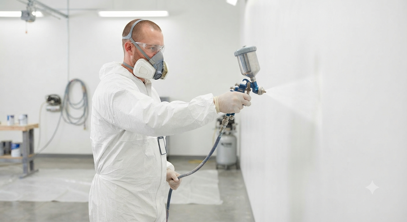
Professional application ensures clean edges and smooth finishes. Expert painters use proper taping techniques and quality tools that prevent bleeding and create crisp lines between colors.
What Are Creative Two-Tone Interior Paint Design Ideas?
Two-tone painting offers versatile interior paint design ideas that add architectural interest to plain walls. This technique divides walls horizontally, creating distinct upper and lower sections that enhance room proportions and style.
Classic wainscoting-inspired two-tone designs place darker colors on bottom portions and lighter shades above. This traditional approach suits formal dining rooms and entryways. The darker lower section hides scuffs and wear while the lighter upper portion keeps ceilings feeling high.
Reverse this approach by painting upper walls darker and lower sections lighter for modern, unexpected looks. This technique draws eyes upward, making standard-height ceilings appear taller. It works well in contemporary spaces and home offices.
The division point affects room proportions. Placing the break at chair rail height (approximately 32 inches) creates traditional, balanced looks. Raising the division to two-thirds wall height makes ceilings appear higher, while lowering it creates cozier, grounded feelings.
Color selection impacts the overall effect. Pairing white or cream lower sections with soft gray or blue uppers creates beachy, coastal vibes. Combining warm beige bottoms with sage green tops delivers nature-inspired aesthetics. Dramatic combinations like navy below and white above make bold contemporary statements.
Two-tone techniques work exceptionally well in rooms with architectural details. Highlight crown molding by painting it the same color as your upper wall section, creating clean transitions. Emphasize chair rails or picture molding by using them as natural division points.
Consider color psychology when selecting your two tones. Use calmer colors in upper sections where you spend less time looking, reserving more engaging colors for lower walls at eye level when seated.
Two-Tone Painting Ideas:
- Dark bottom, light top (traditional)
- Light bottom, dark top (contemporary)
- Neutral and bold color combinations
- Monochromatic schemes with different values
- Horizontal stripes at varying heights
- Complementary color pairings
Finish consistency matters in two-tone designs. Using the same sheen for both colors creates cohesive looks, while contrasting matte and glossy finishes adds subtle dimension.
Application requires precision. Professional painters ensure perfectly straight lines where colors meet, preventing wavy divisions that make rooms look amateur. They also know how to prepare surfaces properly for clean adhesion.
Two-tone interior paint design ideas extend beyond walls. Apply this concept to kitchen islands, bathroom vanities, or built-in bookshelves for unique, custom looks.
For flawless two-tone painting that enhances your home’s architecture, consider professional services from True Coat.
How Can You Use Interior Paint Design Ideas in Small Spaces?
Small spaces benefit tremendously from thoughtful interior paint design ideas that maximize perceived size and create functional, beautiful environments. Strategic color choices and application techniques transform cramped rooms into comfortable, inviting spaces.
Light colors remain the best choice for small rooms. Soft whites, pale grays, and light beiges reflect more natural and artificial light, making walls appear to recede and spaces feel larger. These colors create airy, open atmospheres that combat claustrophobia.
Monochromatic schemes work exceptionally well in small spaces. Painting walls, trim, and ceilings the same light color eliminates visual breaks that make rooms feel choppy. This creates seamless flow that tricks eyes into perceiving more space.
Cool colors like soft blues and pale greens make walls appear farther away than warm colors. If your small room lacks natural light, choose cool-toned light grays or pale aquas that open spaces without feeling cold.
Avoid stark white in small rooms with limited natural light, as it can appear dingy or gray. Instead, choose warm whites with cream or ivory undertones that feel brighter and more inviting.
Strategic accent walls work in small spaces when applied correctly. Paint the wall farthest from the entry a slightly deeper shade to create depth perception. Avoid painting side walls darker, as this makes narrow rooms feel more confined.
Painting ceilings slightly lighter than walls or in pure white draws eyes upward and creates height illusions. Conversely, painting ceilings the same color as walls in small, cozy spaces like powder rooms creates intimate cocoons.
Vertical stripes painted on walls make low ceilings appear higher. Use subtle tone-on-tone stripes rather than high-contrast patterns that overwhelm small spaces. This technique particularly suits narrow hallways and compact bathrooms.
Glossy or satin paint finishes reflect more light than matte finishes, brightening small rooms and making them feel more spacious. Use these sheens on walls while keeping ceilings matte to prevent too much light reflection.
Small Space Paint Strategies:
- Use light, reflective colors
- Create monochromatic color schemes
- Choose cool-toned neutrals
- Paint ceilings lighter or matching
- Apply subtle vertical stripes
- Select satin or semi-gloss finishes
- Minimize color contrasts
- Use accent walls strategically
Color continuity between small connecting rooms creates flow and prevents choppiness. Painting a small apartment or condo in one cohesive color makes the entire space feel larger than using different colors in each room.
Natural light direction influences color choices. Small north-facing rooms benefit from warm yellows or peachy whites that compensate for cool natural light. South-facing small rooms can handle cooler colors without feeling cold.
Professional painters understand how to maximize small spaces through paint. They know which techniques create specific effects and can recommend interior paint design ideas suited to your room’s dimensions and challenges. For expert guidance on small space painting, contact True Coat.
Things to Know About Interior Paint Design Ideas
Understanding key facts about interior paint design ideas helps you make informed decisions and achieve professional-looking results in your home.
Paint Finish Selection Matters
Different sheens serve different purposes. Flat or matte finishes hide wall imperfections and create sophisticated, non-reflective surfaces ideal for low-traffic areas like bedrooms. Eggshell offers slight sheen with better cleanability, suiting living rooms and hallways. Satin finishes work well in kitchens and bathrooms where moisture and cleaning occur. Semi-gloss and gloss finishes suit trim, doors, and high-moisture areas but show every surface flaw.
Sample Before Committing
Paint colors look different in stores than in your home. Always purchase sample sizes and paint large swatches (at least 2 feet by 2 feet) on your actual walls. Observe how colors change throughout the day as natural light shifts. What looks perfect at noon might appear entirely different at sunset.
Surface Preparation Determines Results
The most beautiful paint color fails without proper surface preparation. Walls need cleaning, patching, sanding, and priming before painting. Skipping these steps leads to uneven coverage, visible imperfections, and premature paint failure. Professional preparation ensures colors appear exactly as intended.
Quality Paint Pays Off
Premium paints cost more upfront but provide better coverage, durability, and color retention. They often require fewer coats and last longer than budget options. Quality paints also contain lower VOC levels, improving indoor air quality.
Lighting Affects Color Perception
Artificial lighting changes how paint colors appear. Incandescent bulbs add warmth, making colors appear yellower. LED and fluorescent lighting casts cooler tones. Consider your room’s primary lighting source when selecting colors. Test samples under both natural and artificial light.
Color Flow Creates Cohesion
Connected spaces benefit from coordinated color schemes. You don’t need identical colors throughout, but choose shades that complement each other. If your living room features warm gray, continue with similar undertones in adjacent spaces rather than switching to cool gray.
Undertones Make or Break Color Schemes
Every paint color contains undertones, subtle hints of other colors that emerge in different lighting. Beige might have pink, yellow, or green undertones. Understanding undertones prevents surprising color shifts and helps you create harmonious combinations.
Professional Help Saves Time and Money
While DIY painting appeals to many homeowners, professional painters deliver superior results efficiently. They possess equipment, experience, and knowledge that prevent common mistakes. True Coat brings expertise in interior paint design ideas that transform homes beautifully and durably.
Considerations for Interior Paint Design Ideas:
- Match paint finish to room function
- Test multiple samples in actual lighting
- Invest in proper surface preparation
- Choose quality paints for better results
- Account for natural and artificial lighting
- Create color flow between connected spaces
- Understand and identify color undertones
- Consider professional application for best outcomes
When planning your next painting project, consulting with professional painting services provides valuable insights and ensures beautiful, lasting results.
Wrapping Up
Interior paint design ideas transform houses into personalized homes that reflect your style while creating functional, beautiful spaces. From understanding color psychology to applying creative techniques like accent walls and two-tone designs, these strategies help you make confident decisions about your home’s appearance.
The most successful paint projects combine thoughtful color selection with proper application techniques. Whether you choose trending 2026 colors, timeless neutrals, or bold combinations, your interior paint design ideas should suit your lifestyle, enhance your home’s architecture, and create atmospheres that support how you live.
Professional guidance makes implementing interior paint design ideas easier and more successful. True Coat combines expertise in color consultation, surface preparation, and flawless application to deliver results that exceed expectations. With years of experience serving Winnipeg homeowners, True Coat understands local preferences and challenges unique to our climate.
Ready to transform your home with stunning interior paint design ideas? Contact True Coat today for your free, no-obligation estimate. Our licensed and insured team provides high-quality, affordably priced services that bring your vision to life beautifully and durably.
Frequently Asked Questions
Which color is best for interior paint?
The best color depends on room function and personal preference. Warm neutrals like greige and beige work universally across spaces. For bedrooms, choose calming blues or soft greens. Kitchens benefit from whites or warm yellows. Living rooms suit versatile grays or beiges that adapt to different decor. Consider lighting conditions and room size when selecting colors.
What is the 3 color rule in interior design?
The 3 color rule, or 60-30-10 rule, creates balanced color schemes by distributing colors proportionally. Use your dominant color for 60% of the space (usually walls), secondary color for 30% (furniture and curtains), and accent color for 10% (decorative accessories). This prevents overwhelming spaces while maintaining visual interest and harmony.
What are the new interior colors for 2026?
New 2026 interior colors emphasize nature-inspired palettes including mossy greens, warm terracotta, creamy whites, soft water blues, rich chocolate browns, dusty rose, and warm charcoal grays. These colors promote wellness and connection to nature while creating sophisticated, calming environments. They work well together in layered, tonal combinations.
What is the most popular paint color for interiors?
Warm gray remains the most popular interior paint color, specifically shades like Agreeable Gray and Repose Gray. These versatile neutrals work with any decor style, adapt to different lighting, and appeal broadly. Warm whites follow closely, offering clean, bright alternatives. These colors succeed because they provide flexible backdrops for changing furniture and accessories.
Which 3 color combination is best?
The best 3 color combination depends on your style, but proven pairings include navy-white-gold for sophistication, soft gray-blush-brass for contemporary elegance, and forest green-cream-terracotta for earthy warmth. Ensure all colors share similar undertones (warm or cool) for harmony. Test combinations using samples before committing to full rooms.