Interior paint wall colors can make or break the atmosphere in your home. Choosing the right shade involves understanding how colors affect mood, considering natural and artificial lighting, testing samples in your actual space, and selecting appropriate finishes for each room.
The best interior paint wall colors balance personal preference with practical considerations like room size, existing furniture, and the amount of natural light available.
Whether you prefer neutral tones that stand the test of time or bold accent walls that make a statement, the key is selecting colors that create the environment you want while complementing your home’s architecture and your lifestyle needs.
Why Do Interior Paint Wall Colors Matter?
Interior paint wall colors shape how you experience every room in your home. The shades you choose affect your emotions, energy levels, and even how you interact with family and guests.
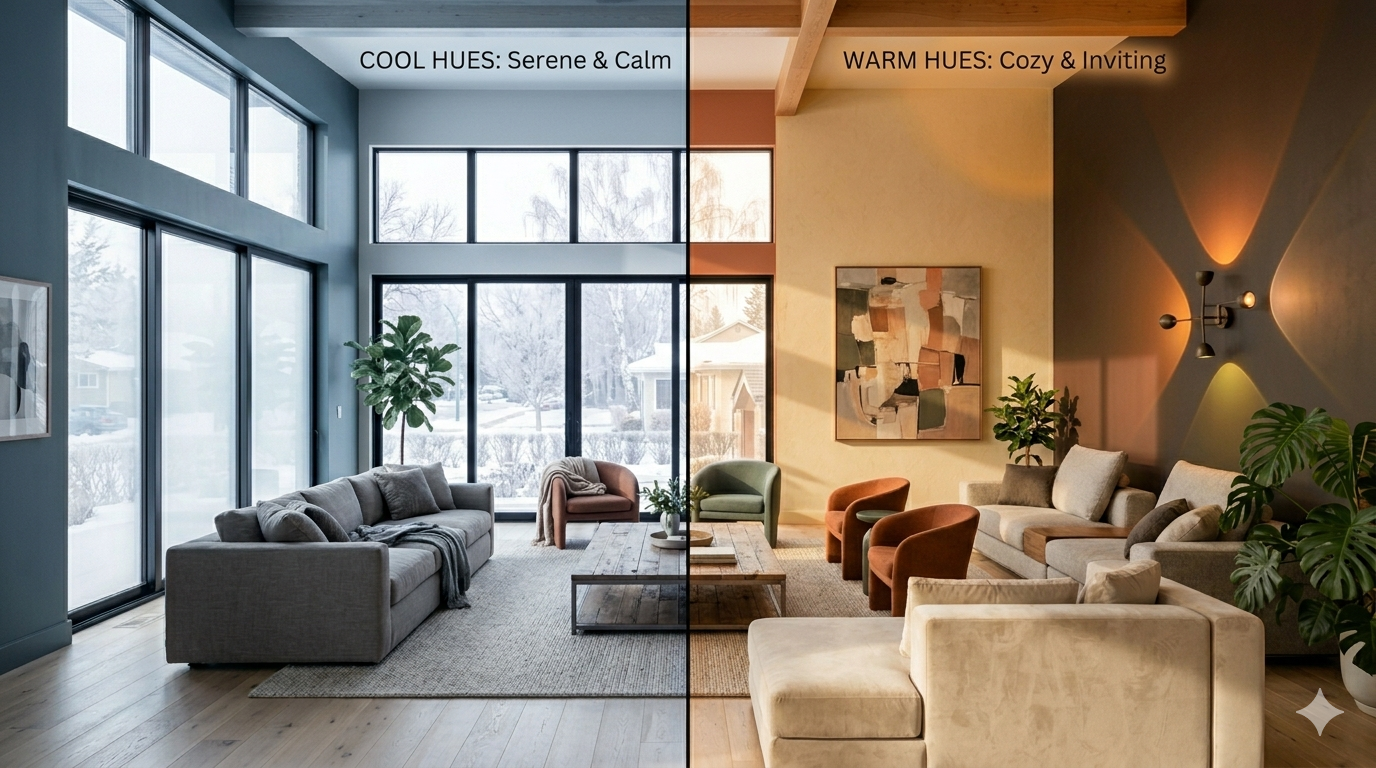
Color has real psychological power. Blues and greens typically create calm, relaxing spaces perfect for bedrooms and bathrooms. Warm tones like yellows and oranges energize kitchens and dining areas where families gather. Neutrals provide versatile backdrops that work anywhere.
Your interior paint wall colors also influence how large or small a room feels. Light shades make tight spaces appear more open and airy. Dark colors add coziness and intimacy to large rooms that might otherwise feel cold or empty.
The colors you select impact your home’s resale value too. According to residential painting experts, homes with well-chosen, neutral palettes often appeal to more buyers. That doesn’t mean you can’t have personality, it just means balance matters.
Paint color affects how your furniture, artwork, and decor look. A sofa that looked perfect in the store might clash with the wrong wall color. Your interior paint wall colors should enhance your existing pieces, not fight against them.
How Do Different Interior Paint Wall Colors Affect Room Atmosphere?
Every color tells a different story and creates a unique feeling in your space. Understanding these effects helps you make smarter choices for each room.
Warm Colors and Their Impact
Warm interior paint wall colors include reds, oranges, yellows, and warm neutrals like beige and cream. These shades bring energy and warmth to any space.
Red stimulates conversation and appetite, making it popular for dining rooms. However, too much red can feel overwhelming. Consider using it as an accent wall rather than covering an entire room.
Orange creates a friendly, welcoming atmosphere. It works well in social spaces like living rooms and home offices where creativity matters. Softer peach or coral tones offer the same warmth without the intensity.
Yellow brings sunshine indoors. Pale yellows work beautifully in kitchens and breakfast nooks, promoting cheerfulness during morning routines. Deeper golden yellows add richness to living areas.
Warm neutrals like tan, beige, and cream provide flexibility. These interior paint wall colors pair well with almost any decor style and create cozy, inviting environments throughout your home.
Cool Colors and Their Benefits
Cool interior paint wall colors encompass blues, greens, purples, and cool grays. These shades typically calm and refresh.
Blue is the most popular color for bedrooms because it promotes relaxation and better sleep. Lighter blues make small rooms feel larger, while navy creates sophisticated, dramatic spaces.
Green connects us to nature and reduces stress. Sage green has become increasingly popular for its versatility. It works in bedrooms, bathrooms, living rooms, and even kitchens. Deeper forest greens add elegance to formal spaces.
Purple ranges from calming lavender to luxurious deep plum. Lighter purples suit bedrooms and bathrooms, while richer purples create statement walls in living areas or home offices.
Gray remains a neutral favorite. Cool grays with blue or green undertones feel modern and fresh. They provide excellent backdrops for colorful furniture and artwork while maintaining a clean aesthetic.
Neutral Colors for Versatility
Neutral interior paint wall colors include whites, grays, beiges, and taupes. These timeless choices offer maximum flexibility for changing decor over time.
White brightens spaces and makes them feel clean and open. Bright whites work well in modern homes with lots of natural light. Warmer whites with cream or beige undertones suit traditional spaces and rooms with less light.
Greige, a blend of gray and beige, has become one of the most requested interior paint wall colors. It offers the warmth of beige with the contemporary feel of gray, working beautifully in open-concept homes.
True Coat’s team of experienced professionals can help you navigate the subtle differences between neutral shades to find the perfect match for your space.
What Factors Should You Consider When Selecting Interior Paint Wall Colors?
Choosing interior paint wall colors involves more than just picking your favorite shade. Several practical factors determine whether a color will work in your specific space.
Room Size and Layout
The size of your room dramatically impacts how colors appear and function. Small rooms benefit from light interior paint wall colors that reflect light and create an illusion of more space. Whites, pale blues, soft grays, and light greens work particularly well.
Large rooms can handle darker, richer colors without feeling cramped. Deep blues, charcoal grays, or warm chocolates add intimacy and sophistication to spacious areas that might otherwise feel empty or cold.
Room shape matters too. Long, narrow rooms benefit from painting the shorter walls a darker shade to visually pull them closer, making the space feel more balanced. Low ceilings appear higher when painted lighter than the walls.
Natural and Artificial Lighting
Lighting transforms how interior paint wall colors appear throughout the day. A shade that looks perfect at noon might seem completely different at night under artificial lights.
North-facing rooms receive cooler, indirect light that can make colors appear darker and flatter. These spaces often need warmer interior paint wall colors to feel inviting.
South-facing rooms get abundant warm, natural light that can intensify colors. Cooler shades often balance this warmth beautifully, though warm colors can create a sunny, cheerful atmosphere.
East-facing rooms receive warm morning light that shifts to cooler tones in the afternoon. West-facing rooms experience the opposite pattern, with warm, golden evening light.
Artificial lighting also affects color perception. Incandescent bulbs add warmth, making cool colors appear more neutral. LED and fluorescent lights vary widely, with some adding blue tones and others leaning yellow.
Existing Elements in Your Space
Your flooring, furniture, and permanent fixtures influence which interior paint wall colors will work best. Hardwood floors with warm, golden tones pair beautifully with both warm neutrals and cool grays. Cool-toned gray flooring works well with crisp whites and modern grays.
Consider your countertops, tile, and cabinetry. These elements often stay in place longer than paint, so your wall colors should complement them. If you have granite countertops with warm veining, choose interior paint wall colors that harmonize with those tones.
Your furniture matters too. If you have a bold, colorful sofa you love, select wall colors that let it shine rather than competing for attention. Neutral walls with colorful furniture create a balanced, flexible scheme.
How Do You Choose Interior Paint Wall Colors for Specific Rooms?
Each room in your home serves a different purpose, and your interior paint wall colors should reflect those unique functions.
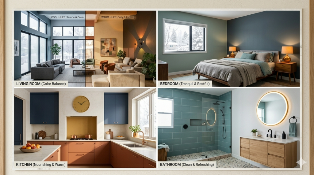
Living Rooms and Common Areas
Living rooms are social hubs where families gather and guests visit. The best interior paint wall colors for these spaces balance warmth with versatility.
Neutral shades like greige, warm gray, or soft beige create welcoming environments that work with changing decor. These colors provide a sophisticated backdrop for furniture, artwork, and seasonal decorations.
If you prefer more color, consider soft blues, sage greens, or warm terracottas. These shades add personality while remaining versatile enough for different furniture arrangements and decor styles.
For open-concept homes, your living room color should flow naturally into adjacent spaces. Using variations of the same color family throughout creates visual harmony. True Coat specializes in interior painting that creates seamless transitions between connected spaces.
Bedrooms for Rest and Relaxation
Bedrooms need calming interior paint wall colors that promote rest. Cool tones typically work best, though personal preference matters most in private spaces.
Soft blues remain the top choice for master bedrooms. They reduce stress and help regulate sleep patterns. Pale blue-grays combine the calming effect of blue with the sophistication of gray.
Gentle greens create serene, nature-inspired spaces. Sage, seafoam, and soft mint all promote relaxation without feeling cold. Warm greens with yellow undertones work in rooms with limited natural light.
Lavender and soft purple provide a unique alternative. These shades feel luxurious while maintaining a calm atmosphere. Pair them with white trim and neutral bedding for balance.
Warm neutrals like cream, soft tan, or blush also work beautifully in bedrooms. They create cozy, inviting spaces that feel like true retreats.
Kitchens and Dining Spaces
Kitchens benefit from interior paint wall colors that feel clean, energizing, and appetite-friendly. White remains popular because it reflects light and makes spaces feel fresh and spacious.
Warm neutrals like cream, beige, or warm gray create inviting kitchen environments. They hide minor imperfections better than stark white while maintaining a clean aesthetic.
Soft yellows bring cheerfulness to kitchens, making morning routines more pleasant. Pale yellow works particularly well in breakfast nooks and eat-in kitchen areas.
For dining rooms, consider richer shades that make meals feel more special. Deep blues, warm terracottas, or rich greens create intimate, elegant dining experiences. These deeper interior paint wall colors make candlelit dinners feel more sophisticated.
Bathrooms for Clean and Fresh Feelings
Bathrooms need interior paint wall colors that feel clean and spa-like. Cool tones typically work best because they evoke water and cleanliness.
Light blues and aquas create obvious connections to water, making bathrooms feel fresh and relaxing. These shades work particularly well in bathrooms with white fixtures and chrome hardware.
Soft grays provide a modern, clean aesthetic. They pair beautifully with white tile and create versatile backgrounds for colorful towels and accessories.
Pale greens bring a spa feeling to bathrooms. Seafoam, mint, and soft sage all create calming environments perfect for unwinding in the tub.
White remains a classic bathroom choice. It maximizes light in often-windowless spaces and creates a timeless, clean look. For bathroom painting needs, consulting with the best interior painting companies ensures proper surface preparation and moisture-resistant application.
What Are the Best Interior Paint Wall Colors for 2025?
Current trends in interior paint wall colors balance timeless appeal with fresh, contemporary feels. Homeowners increasingly choose shades that offer flexibility and longevity.
Trending Color Palettes
Warm, earthy neutrals dominate 2025 trends. Creamy whites, soft taupes, and warm grays create cozy, organic environments. These interior paint wall colors work with natural materials like wood and stone that remain popular in home design.
Greige continues its reign as a favorite neutral. This perfect blend of gray and beige offers the best of both worlds, working in traditional and modern homes alike.
Soft, muted greens have surged in popularity. Sage, olive, and moss greens connect interiors to nature while remaining sophisticated enough for any room. These shades pair beautifully with natural wood tones and brass fixtures.
Warm terracotta and clay tones bring Southwestern and Mediterranean influences indoors. These interior paint wall colors add warmth and personality without overwhelming spaces.
Dusty blues and soft navy provide calming alternatives to gray. They offer more character than neutral grays while maintaining similar versatility.
Timeless Colors That Never Go Out of Style
While trends come and go, certain interior paint wall colors remain perpetually appealing. These classics ensure your home feels current for years to come.
Soft white in various shades never goes out of style. Whether you choose warm whites with creamy undertones or crisp, clean whites, these colors provide timeless elegance and maximum light reflection.
Classic beige and tan remain reliable choices. They create warm, welcoming environments that work with virtually any furniture style or decor preference.
True gray, whether warm or cool-toned, offers modern sophistication that transcends trends. Medium grays work particularly well in contemporary homes.
Navy blue has proven its staying power. This rich, classic color works as a dramatic accent or throughout entire rooms, providing depth and elegance that never feels dated.
How Can You Test Interior Paint Wall Colors Before Committing?
Testing interior paint wall colors before painting entire rooms saves time, money, and regret. Several methods help you preview colors accurately.
Paint Samples on Your Walls
The most reliable way to test interior paint wall colors involves painting large samples directly on your walls. Small paint chips and swatches simply don’t provide enough information.
Purchase sample-sized paint cans in your top color choices. Paint squares at least two feet by two feet on your wall. This size gives you enough area to see the color properly in your space.
Paint samples on multiple walls in the same room. Colors look different on walls that receive different amounts of light. A shade that looks perfect on a sun-drenched south wall might appear completely different on a darker north wall.
Live with your samples for several days. Observe how they look at different times of day, under various lighting conditions, and next to your furniture and decor. Interior paint wall colors shift appearance dramatically between morning and evening.
Use Peel-and-Stick Color Samples
Peel-and-stick color samples offer a mess-free testing alternative. These large, removable sheets come in various paint colors and stick directly to your walls.
While convenient, these samples may not exactly match actual paint colors. Paint has texture and depth that printed samples can’t perfectly replicate. Use these as a preliminary screening tool, then test your final choices with real paint.
Consider Digital Visualization Tools
Many paint companies offer apps that let you visualize colors in photos of your room. While helpful for initial exploration, don’t rely solely on digital tools. Screens display colors differently than they appear in real life.
Use these tools to narrow your choices, then test finalist colors with actual paint samples on your walls.
What Interior Paint Wall Colors Work Best Together?
Creating a cohesive color flow throughout your home requires thoughtful coordination. Your interior paint wall colors should work together without feeling monotonous.
The 60-30-10 Color Rule
Interior designers often use the 60-30-10 rule for balanced color schemes. This principle works for furniture and decor, but also guides paint color selection throughout your home.
Sixty percent of your home should feature your dominant color, typically a neutral shade on most walls. Thirty percent uses your secondary color, perhaps in bedrooms or an accent room. Ten percent highlights your accent color, possibly in a powder room or on a single feature wall.
This approach creates variety while maintaining harmony. You might use soft gray as your dominant color in living spaces, sage green as your secondary color in bedrooms, and deep navy as an accent in the office.
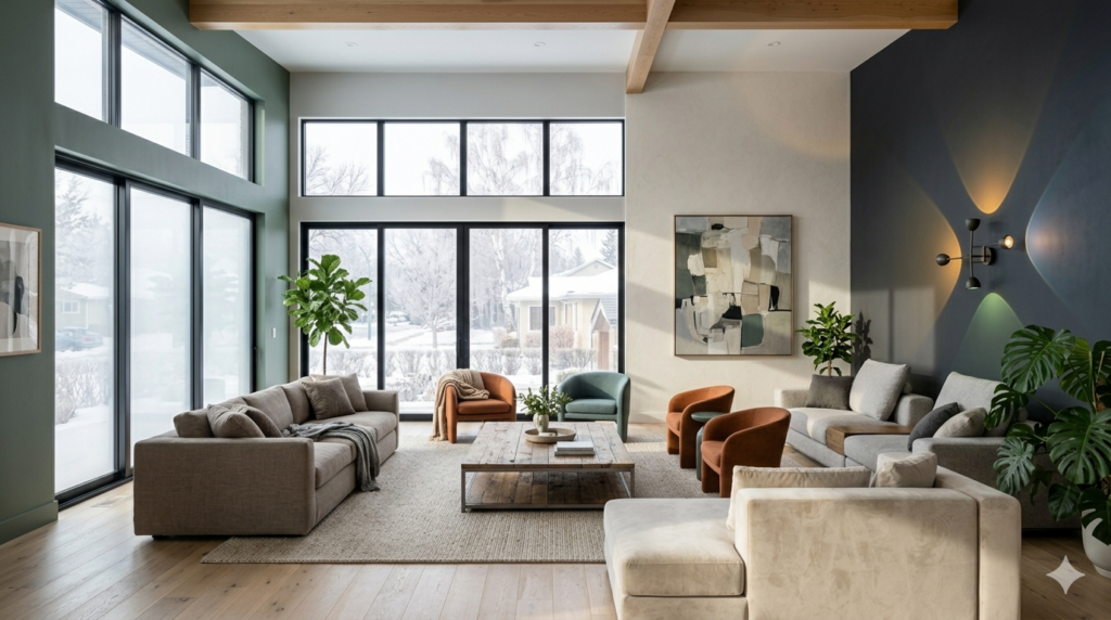
Creating Flow in Open-Concept Spaces
Open-concept homes present unique challenges for interior paint wall colors. You want definition between spaces without harsh visual breaks.
Using different shades from the same color family creates subtle transitions. For example, a lighter gray in the kitchen, medium gray in the dining area, and slightly darker gray in the living room provides variation while maintaining cohesion.
Alternatively, use the same neutral color throughout open spaces, then introduce different colors in private rooms like bedrooms and bathrooms. This approach creates a calm, unified feeling in social areas while allowing personality in personal spaces.
Trim and ceiling color also impact flow. Keeping trim consistent throughout your home, typically in white or cream, ties different wall colors together visually.
Things To Know About Interior Paint Wall Colors
Before starting your painting project, understanding these key points helps you make informed decisions and avoid common mistakes.
Color samples look different on walls than on chips. Small paint chips can’t show how colors interact with your lighting, flooring, and furniture. Always test samples on your actual walls before committing.
Sheen affects color perception. The same color appears lighter in high-gloss finishes and darker in flat or matte finishes. Your chosen sheen impacts the final look as much as the color itself.
Paint colors have undertones. Every color contains underlying hints of other colors. Gray might have blue, green, or purple undertones. White can lean yellow, pink, or blue. These undertones become visible in your home’s lighting.
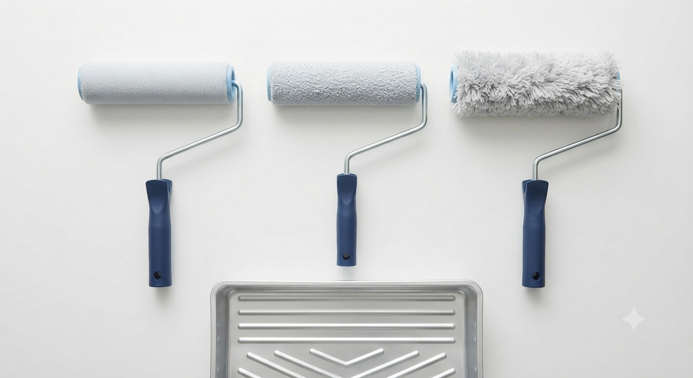
One coat rarely covers perfectly. Most interior paint wall colors require at least two coats for even coverage, especially when covering darker existing colors or painting over bold patterns.
Quality paint makes a difference. Premium paints offer better coverage, richer colors, and longer-lasting finishes. They often require fewer coats, actually saving money despite higher upfront costs.
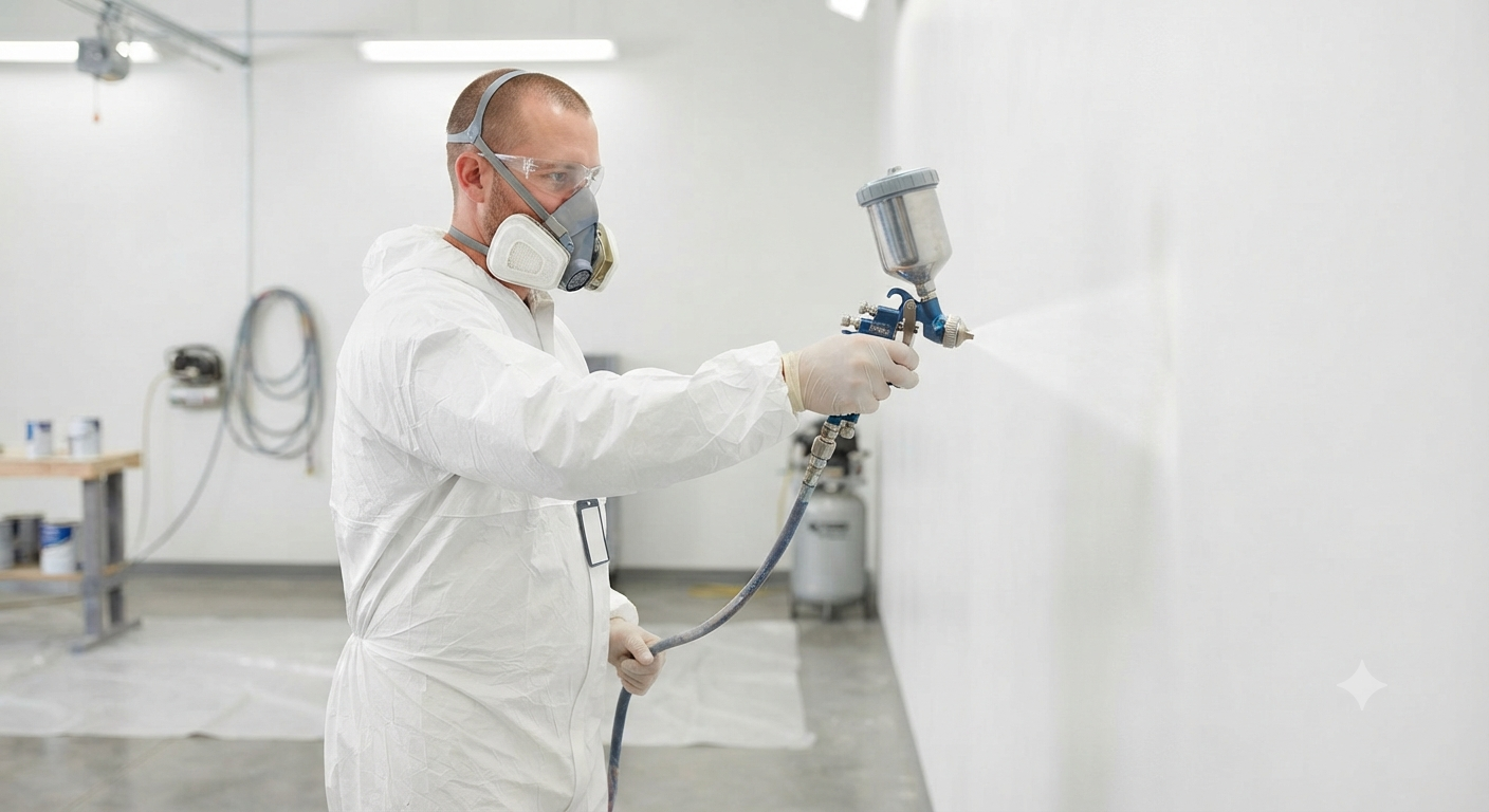
Professional preparation matters. Proper surface preparation determines how your final paint job looks and lasts. True Coat’s professional painters ensure walls are properly cleaned, repaired, and primed before applying your chosen interior paint wall colors.
VOC levels impact air quality. Low-VOC or zero-VOC paints reduce harmful emissions, creating healthier indoor environments. These options are particularly important in bedrooms and spaces used by children.
How Do You Coordinate Interior Paint Wall Colors with Finishes?
The finish you choose affects both the appearance and durability of your interior paint wall colors. Different rooms need different finishes based on use and lighting.
| Paint Finish | Best For | Advantages | Considerations |
| Flat/Matte | Bedrooms, Ceilings, Low-Traffic Areas | Hides imperfections, Provides rich color depth, No glare | Difficult to clean, Shows marks easily |
| Eggshell | Living Rooms, Dining Rooms, Bedrooms | Slight sheen, Easier to clean than flat, Hides minor flaws | Not as durable as satin |
| Satin | Kitchens, Bathrooms, Kids’ Rooms, High-Traffic Hallways | Washable, Moisture-resistant, Subtle shine | Shows application imperfections |
| Semi-Gloss | Trim, Doors, Cabinets, Bathrooms, Kitchens | Very durable, Easy to clean, Resists moisture | Highlights wall imperfections |
| High-Gloss | Cabinets, Furniture, Accent Details | Extremely durable, Dramatic shine, Easy to clean | Shows every flaw, Reflects light intensely |
Matching Finish to Room Function
Bedrooms work best with flat or eggshell finishes. These sheens create soft, restful environments without glare. The matte appearance enhances the calming effect of your chosen interior paint wall colors.
Kitchens and bathrooms need more durable finishes. Satin or semi-gloss withstands moisture and frequent cleaning. These finishes protect walls from splashes, humidity, and everyday wear.
High-traffic areas like hallways, staircases, and children’s rooms benefit from satin finishes. The slight sheen makes cleaning fingerprints and scuff marks easier while maintaining an attractive appearance.
Ceilings typically use flat paint. This finish hides imperfections and prevents distracting light reflection. White or light-colored ceiling paint makes rooms feel taller and brighter.
Trim, doors, and molding look best in semi-gloss or high-gloss. These finishes create visual contrast with walls, making architectural details stand out. The durability also protects frequently touched surfaces.
What Common Mistakes Should You Avoid with Interior Paint Wall Colors?
Even with careful planning, certain pitfalls can derail your painting project. Avoiding these mistakes saves time, money, and frustration.
Choosing Colors in the Wrong Lighting
Never select interior paint wall colors based solely on how they look in the store. Paint showrooms use specific lighting that differs dramatically from your home’s natural and artificial light.
Take paint chips home and observe them in your space at different times of day. Morning light, afternoon sun, and evening artificial lighting all change color appearance significantly.
Ignoring Undertones
Many people choose a gray only to discover it looks purple, blue, or green on their walls. Every paint color has undertones that become apparent in your home’s lighting.
Compare your color choice against pure white to identify undertones. Ask yourself whether the color leans warm or cool, and ensure that direction matches your vision and existing decor.
Painting Without Testing
Skipping the sample testing phase leads to expensive mistakes. Buying gallons of paint without seeing it on your walls first is a gamble that rarely pays off.
Invest in sample cans and spend a week living with test patches. This small upfront cost prevents the much larger expense of repainting with different interior paint wall colors.
Forgetting About Adjacent Rooms
Your wall colors don’t exist in isolation. The color in your living room affects how the hallway color looks and vice versa. Consider how colors flow from room to room, especially in homes with open sightlines.
Stand in doorways and notice which colors you see simultaneously. Make sure your choices create harmony rather than jarring transitions.
Choosing Trendy Colors You Don’t Love
Trends provide inspiration, but don’t paint your entire home in a color just because it’s popular. You live with your interior paint wall colors every day. Choose shades you genuinely love rather than following trends that might not suit your taste or lifestyle.
If you want to try trendy colors, use them in small doses like accent walls or easily changeable spaces like powder rooms.
How Can True Coat Help with Your Interior Paint Wall Colors?
Selecting and applying interior paint wall colors requires expertise, experience, and attention to detail. True Coat brings all three to every project.
Our team offers professional color consultation to help you navigate the overwhelming world of paint choices. We understand how colors interact with lighting, how undertones affect final appearance, and which shades work best in different spaces.
We prepare surfaces properly before painting, ensuring your chosen interior paint wall colors look their absolute best. Proper preparation includes repairing cracks, smoothing rough areas, and applying quality primers that help colors appear true and last longer.
True Coat uses premium paints that provide rich, lasting color. We understand the technical aspects of paint application, from proper mixing to ideal temperature and humidity conditions for application.
Our licensed and insured team protects your home during the painting process. We cover furniture, protect floors, and clean thoroughly when finished. You get beautiful results without the stress or mess of DIY painting.
For expert guidance on choosing and applying interior paint wall colors, contact True Coat for a free estimate. Our Winnipeg-based team serves residential and commercial clients throughout the area, delivering quality results on every project.
Wrapping Up Your Color Journey
Choosing interior paint wall colors transforms your house into a home that reflects your personality and meets your needs. The right colors create the atmosphere you want in each room, from energizing kitchens to relaxing bedrooms.
Remember that successful color selection involves more than just picking your favorite shade. Consider room size, lighting, existing elements, and how colors flow throughout your home. Test samples on your walls, live with them for several days, and trust your instincts.
Whether you choose trending earthy neutrals, timeless whites and grays, or bold accent colors, make sure your selections work for your lifestyle and bring you joy. Your interior paint wall colors should make you smile every time you walk through your door.
Professional guidance and application make all the difference in achieving beautiful, lasting results. True Coat’s experienced team can help you select perfect colors and apply them flawlessly, ensuring your vision becomes reality.
Ready to transform your space with the perfect interior paint wall colors? Contact True Coat today for expert advice and a free quote on your next painting project.
Frequently Asked Questions
How do interior paint wall colors affect the mood of a room?
Interior paint wall colors directly influence emotions and energy levels through color psychology. Warm colors like reds, oranges, and yellows stimulate conversation and activity, making them ideal for social spaces like dining rooms and kitchens. Cool colors such as blues, greens, and purples promote calmness and relaxation, working best in bedrooms and bathrooms. Neutrals provide versatile backdrops that adapt to various moods depending on lighting and decor. The intensity of the color also matters; soft, muted tones create gentle atmospheres while bold, saturated shades energize spaces.
What are the best interior paint wall colors for small spaces?
Light, cool-toned interior paint wall colors make small rooms feel larger and more open. Soft whites, pale grays, light blues, and gentle greens reflect light effectively, creating an airy atmosphere that expands visual space. These colors work particularly well when extended onto trim and ceilings, eliminating visual breaks that can make rooms feel choppy. For added depth without sacrificing spaciousness, consider painting one accent wall a slightly darker shade while keeping other walls light. Avoid dark, warm colors in truly tiny spaces, as they tend to make walls feel closer and rooms more confined.
Should I choose trendy or timeless interior paint wall colors?
Timeless interior paint wall colors offer better long-term value and broader appeal, but trendy accents add personality. Classic neutrals like soft whites, warm grays, beiges, and navy blues remain appealing for decades, protecting your investment and appealing to future buyers if you sell. Use trendy colors strategically in easily changeable spaces like powder rooms, accent walls, or rooms where you plan to update decor regularly. This approach lets you enjoy current styles without committing your entire home to colors that might feel dated in a few years. Balance is key; a mostly neutral palette with one or two trend-forward elements creates a fresh look with staying power.
How do I test interior paint wall colors before committing?
Paint large samples directly on your walls and observe them for several days under different lighting conditions. Purchase sample-sized paint cans and apply two-foot squares on multiple walls in the room, as the same color looks different depending on light exposure. View your samples in morning sunlight, afternoon shade, and evening artificial light to see how the color shifts throughout the day. Compare samples against your furniture, flooring, and fixed elements to ensure harmony. Live with the samples for at least three to five days before making your final decision, as first impressions can change once you experience the color in your daily routine.
What paint finish should I use for different interior paint wall colors?
Match your paint finish to room function and the color’s role in your design scheme. Flat or matte finishes work best for bedrooms and low-traffic areas, providing rich color depth while hiding wall imperfections. Eggshell offers slight durability with minimal sheen, ideal for living rooms and dining areas. Satin finishes suit high-traffic spaces like hallways, kids’ rooms, and bathrooms where washability matters. Semi-gloss and high-gloss finishes work on trim, doors, and cabinets, creating contrast with walls while offering maximum durability. Darker interior paint wall colors often look richer in matte finishes, while lighter colors can handle more sheen without appearing washed out.