Choosing the right colors for interior paint can completely transform how a room looks and feels. The best colors for interior paint balance the mood of the space, the amount of natural light, and your personal style.
Whether you are freshening up a living room, a bedroom, or a kitchen, picking the right shade matters more than most people think.
In this article, you will learn which colors for interior paint work best room by room, how lighting affects your color choice, which finishes hold up best, and what things to consider before you commit to a shade.
You will also find helpful tables, practical tips, and answers to the most common questions homeowners ask about colors for interior paint in Canada.
What Are the Best Colors for Interior Paint?
The best colors for interior paint are those that suit your lifestyle, the purpose of the room, and how much natural light comes in.
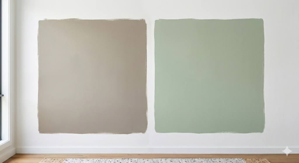
Neutral shades like warm white, greige (grey-beige), and soft taupe remain consistently popular in Canada because they are versatile and timeless.
However, bold choices like deep navy, forest green, and terracotta are gaining ground as homeowners get more confident with color.
Here is a quick look at what makes certain shades stand out:
| Color | Mood It Creates | Best Room to Use It In |
| Warm White | Clean, airy, open | Living room, hallways |
| Greige (Grey-Beige) | Cozy and modern | Bedroom, main living areas |
| Soft Sage Green | Calm and refreshing | Bathroom, kitchen |
| Deep Navy Blue | Bold and sophisticated | Accent wall, study |
| Light Grey | Neutral and flexible | Office, spare room |
| Terracotta | Warm and earthy | Dining room, entryway |
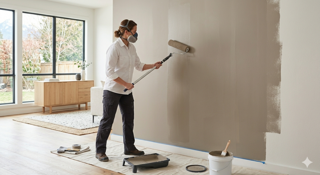
When picking colors for interior paint, always consider how the shade looks at different times of day. A color that looks soft in the morning can shift under artificial lights in the evening. Testing a small sample patch on the wall before committing is always a smart move.
Best Colors for Interior Paint Room by Room
Every room in your home has a different function, and the colors for interior paint you choose should reflect that purpose. A bedroom needs something relaxing, while a kitchen benefits from something energizing and easy to clean.
If you want to see real examples of how color transforms a space, take a look at True Coat’s project gallery for inspiration before you decide.
Living Room Colors for Interior Paint
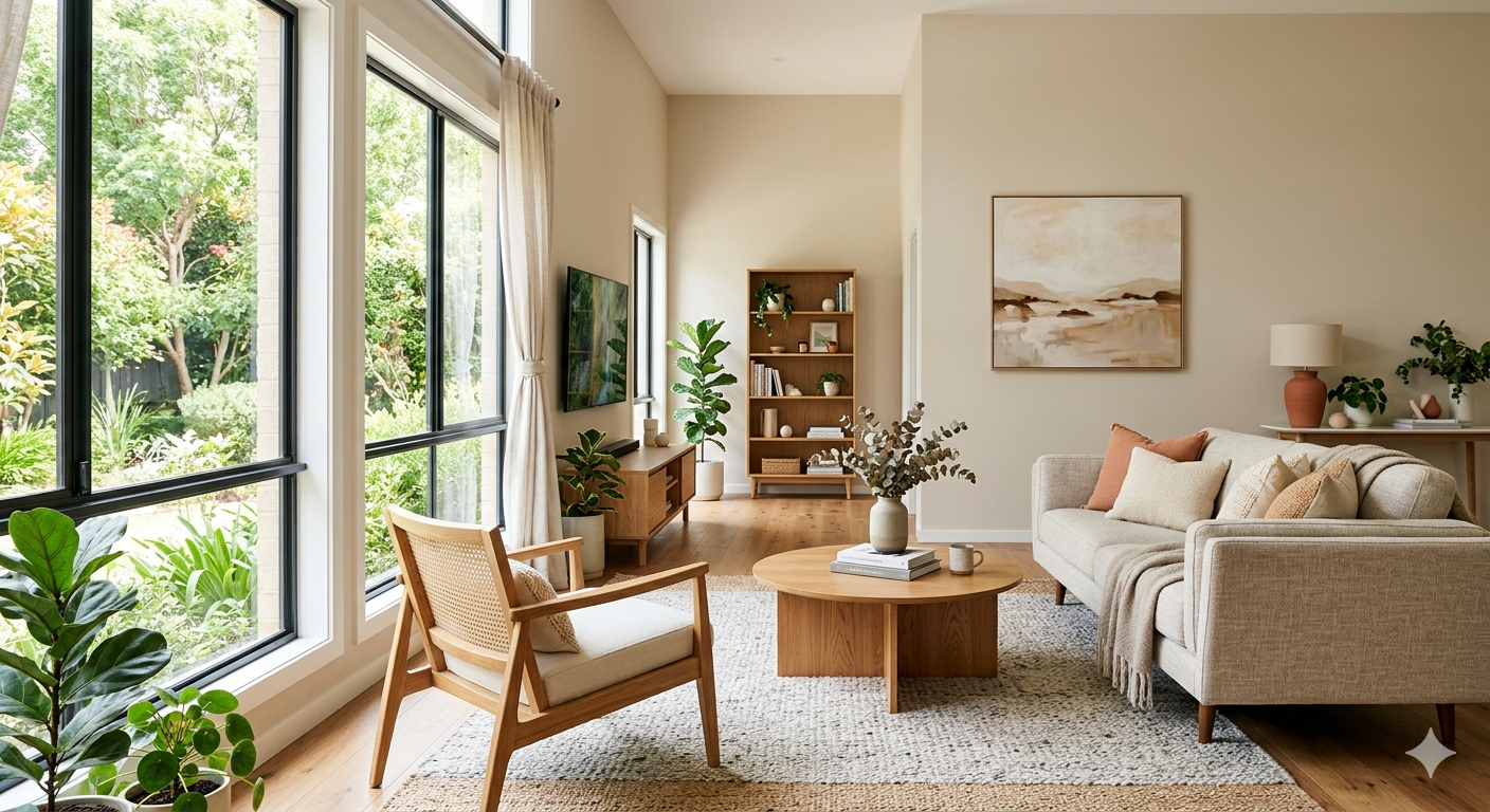
The living room is where you spend quality time with family, so the colors for interior paint here should feel welcoming. Warm whites, soft creams, and light taupes are popular because they make rooms feel larger and brighter.
If you want something with more personality, a muted dusty blue or a warm clay tone adds character without being overwhelming. For a practical tip: if your living room does not get a lot of natural light, avoid dark shades on all four walls. Instead, use a deeper color only on one feature wall and keep the rest lighter to balance the space.
Bedroom Colors for Interior Paint
For bedrooms, colors for interior paint that promote rest and relaxation work best. Soft lavender, muted green, dusty blue, and warm off-white are all solid choices.
Studies in color psychology suggest that blue and green tones lower heart rate and help people wind down before sleep. Avoid overly bright or saturated colors in the bedroom, as these can make it harder to relax.
A great option for Canadian homes during long winters is a warm sand or linen tone, which feels cozy even on grey days.
Kitchen Colors for Interior Paint
Kitchens see a lot of activity, so the best colors for interior paint here should be clean, bright, and easy to wipe down. Crisp white, soft yellow, and light grey work very well.
If you want something bolder, a sage green or navy blue on lower cabinets paired with a light wall color creates a fresh, modern look. Avoid very dark wall colors in small kitchens because they can make the space feel cramped.
Bathroom Colors for Interior Paint
Bathrooms are often smaller, so colors for interior paint that feel light and fresh are the best fit. Crisp white, seafoam, pale blue, and soft mint are classic options.
These shades also pair well with white fixtures, which most bathrooms have. If you want a more spa-like feel, a light taupe or warm stone color works beautifully. Just make sure to use a moisture-resistant paint finish to handle humidity.
How Lighting Affects Colors for Interior Paint
Lighting is one of the most overlooked factors when choosing colors for interior paint. Natural daylight shows a color’s truest tone. North-facing rooms get cooler, shadier light, which makes warm tones like yellows and oranges look better since they counterbalance the cool light.
South-facing rooms get bright, warm light throughout the day, which means cooler shades like blues and greens will look their best.
Artificial lighting also plays a big role. Warm LED or incandescent bulbs bring out the warmth in colours and can make certain shades look more orange or yellow. Cool white LED bulbs push the colour toward the blue or grey end of the spectrum.
A practical tip: always look at your paint sample under the lighting you actually use in the room. Many homeowners choose colors for interior paint in a bright showroom and are surprised when the shade looks different at home.
If you need professional guidance on this, learn more about why hiring interior house painters makes sense for your Winnipeg home before making your final decision.
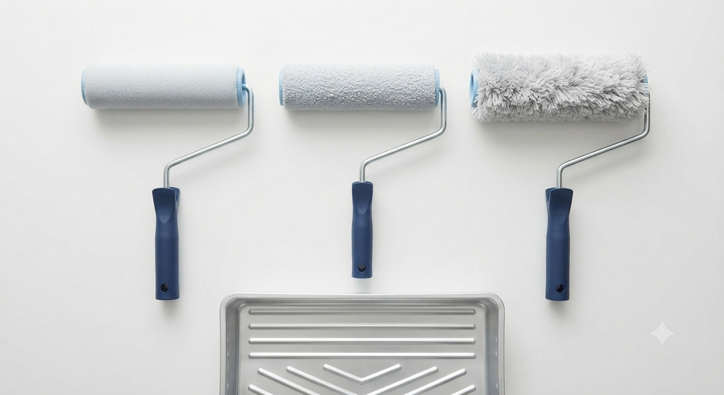
Best Paint Finishes to Pair With Colors for Interior Paint
The finish you choose is just as important as the color itself. Different finishes change how colors for interior paint look on a wall and how well they hold up to daily wear.
| Finish Type | Best For | Key Benefit |
| Flat / Matte | Ceilings, low-traffic areas | Hides surface imperfections well |
| Eggshell | Living rooms, bedrooms | Slight sheen, easy to clean |
| Satin | Kitchens, hallways | Durable and wipeable |
| Semi-Gloss | Bathrooms, trim, doors | Moisture-resistant, easy to clean |
| High Gloss | Cabinets, accent features | Very durable, very shiny finish |
For most interior walls in Canadian homes, an eggshell or satin finish works best with colors for interior paint. They offer a clean, slightly polished look while still being practical enough to wipe down when needed. If your walls have imperfections, a matte finish will hide them much better than a glossy one.
Things to Know Before Choosing Colors for Interior Paint
- Always test paint samples on your actual wall before buying full cans — colors look different on paper or small chips.
- Consider the undertones of a color. A white can look pink, yellow, or blue depending on its undertone, and this affects how it pairs with your furniture.
- Darker colors for interior paint require more coats to achieve an even finish, especially when covering a lighter color.
- In Canada, paint performance matters during seasonal temperature changes. Low-VOC paints are a healthier choice for indoor air quality, especially in winter when homes are tightly sealed.
- If you are painting a rental property, neutral colors for interior paint like soft white or light grey appeal to the widest range of tenants.
- Painting ceilings a slightly lighter version of the wall color creates a cohesive and polished look.
- Colors for interior paint on accent walls should be 2 to 3 shades deeper than the main wall color for a balanced contrast.
Thinking about your home’s outside as well? Read about the best approach to exterior painting for house projects to keep your whole home looking its best.
Professional Help With Colors for Interior Paint in Winnipeg
If you are unsure which colors for interior paint will work best in your home, True Coat is Winnipeg’s licensed and fully insured painting company that offers expert color consultation alongside full residential and commercial painting services.
Their team handles everything from surface preparation to final application, using premium low-VOC paints for a healthier home environment. True Coat also offers a 3-Year Craftsmanship Warranty on completed work.
You can explore their full list of residential and commercial painting services to see everything they offer for homes across Winnipeg.
If you want to explore financing options for your painting project, visit True Coat’s financing page to find a plan that works for your budget. Ready to start? Get your free quote today by visiting True Coat’s contact page.
The Right Colors for Interior Paint Make All the Difference
Getting the colors for interior paint right is not just about picking something that looks good on a chip. It is about matching the color to the room’s light, purpose, and overall feel.
Whether you go with a timeless warm white, a calming sage, or a bold navy accent wall, the key is testing before committing and thinking about how colors for interior paint flow from room to room.
If you want professional guidance and high-quality results, working with an experienced local painting team ensures the finish you see in your mind actually ends up on your walls.
Frequently Asked Questions About Colors for Interior Paint
What are the most popular colors for interior paint in Canada?
Short Answer: Warm whites, greige, and soft grey are the top choices for Canadian homes.
The most popular colors for interior paint across Canadian homes lean toward warm neutrals. Shades like warm white, greige, and pale greens have stayed consistently in demand because they work across different furniture styles, suit varying light conditions, and age well without going out of style.
How do I choose the right colors for interior paint in a small room?
Short Answer: Stick to light, cool, or neutral shades that reflect light and visually open up the space.
For small rooms, light colors for interior paint are your best tool. Pale blue, soft white, and light grey reflect light and make walls feel farther away than they actually are. Avoid painting trim the same dark color as the walls because it removes the visual boundaries that help a room feel defined.
What colors for interior paint make a room look bigger and brighter?
Short Answer: Light neutrals, soft whites, and pale cool tones make rooms feel more open and spacious.
Pale shades with cool undertones are the most effective colors for interior paint for making a room look bigger. White and off-white reflect the most light, which expands a space visually. Painting the ceiling the same light color as the walls also removes hard visual cutoff points that can make rooms feel lower or smaller.
How many colors for interior paint should I use in one home?
Short Answer: Stick to three to five complementary shades throughout the home for a cohesive look.
Using too many unrelated colors for interior paint throughout a home can make it feel choppy and disconnected. A good rule of thumb is to pick one main neutral for most walls, one secondary color for accent rooms or feature walls, and one trim color. This three-color approach creates flow from room to room while still leaving room for personality.
What is the best finish for colors for interior paint on walls?
Short Answer: Eggshell or satin finishes are the best all-round choice for interior walls.
For most interior walls, an eggshell finish gives colors for interior paint a clean, slightly soft sheen without looking too flat or too shiny. It is durable enough for everyday living and easy enough to wipe clean when needed. In higher-traffic areas like hallways or kids’ rooms, a satin finish is a better fit because it holds up better to scrubbing.