What Are the Best Colors for Interior Paint for Your Home?
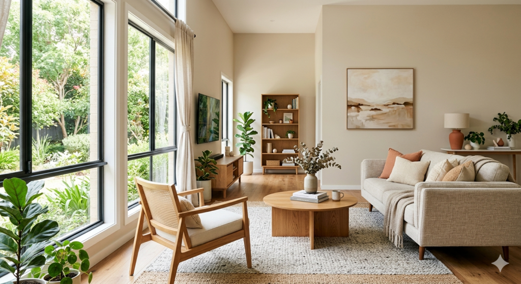
Choosing the right colors for interior paint can completely transform how a room looks and feels. The best colors for interior paint balance the mood of the space, the amount of natural light, and your personal style. Whether you are freshening up a living room, a bedroom, or a kitchen, picking the right shade matters more than most people think. In this article, you will learn which colors for interior paint work best room by room, how lighting affects your color choice, which finishes hold up best, and what things to consider before you commit to a shade. You will also find helpful tables, practical tips, and answers to the most common questions homeowners ask about colors for interior paint in Canada. What Are the Best Colors for Interior Paint? The best colors for interior paint are those that suit your lifestyle, the purpose of the room, and how much natural light comes in. Neutral shades like warm white, greige (grey-beige), and soft taupe remain consistently popular in Canada because they are versatile and timeless. However, bold choices like deep navy, forest green, and terracotta are gaining ground as homeowners get more confident with color. Here is a quick look at what makes certain shades stand out: Color Mood It Creates Best Room to Use It In Warm White Clean, airy, open Living room, hallways Greige (Grey-Beige) Cozy and modern Bedroom, main living areas Soft Sage Green Calm and refreshing Bathroom, kitchen Deep Navy Blue Bold and sophisticated Accent wall, study Light Grey Neutral and flexible Office, spare room Terracotta Warm and earthy Dining room, entryway When picking colors for interior paint, always consider how the shade looks at different times of day. A color that looks soft in the morning can shift under artificial lights in the evening. Testing a small sample patch on the wall before committing is always a smart move. Best Colors for Interior Paint Room by Room Every room in your home has a different function, and the colors for interior paint you choose should reflect that purpose. A bedroom needs something relaxing, while a kitchen benefits from something energizing and easy to clean. If you want to see real examples of how color transforms a space, take a look at True Coat’s project gallery for inspiration before you decide. Living Room Colors for Interior Paint The living room is where you spend quality time with family, so the colors for interior paint here should feel welcoming. Warm whites, soft creams, and light taupes are popular because they make rooms feel larger and brighter. If you want something with more personality, a muted dusty blue or a warm clay tone adds character without being overwhelming. For a practical tip: if your living room does not get a lot of natural light, avoid dark shades on all four walls. Instead, use a deeper color only on one feature wall and keep the rest lighter to balance the space. Bedroom Colors for Interior Paint For bedrooms, colors for interior paint that promote rest and relaxation work best. Soft lavender, muted green, dusty blue, and warm off-white are all solid choices. Studies in color psychology suggest that blue and green tones lower heart rate and help people wind down before sleep. Avoid overly bright or saturated colors in the bedroom, as these can make it harder to relax. A great option for Canadian homes during long winters is a warm sand or linen tone, which feels cozy even on grey days. Kitchen Colors for Interior Paint Kitchens see a lot of activity, so the best colors for interior paint here should be clean, bright, and easy to wipe down. Crisp white, soft yellow, and light grey work very well. If you want something bolder, a sage green or navy blue on lower cabinets paired with a light wall color creates a fresh, modern look. Avoid very dark wall colors in small kitchens because they can make the space feel cramped. Bathroom Colors for Interior Paint Bathrooms are often smaller, so colors for interior paint that feel light and fresh are the best fit. Crisp white, seafoam, pale blue, and soft mint are classic options. These shades also pair well with white fixtures, which most bathrooms have. If you want a more spa-like feel, a light taupe or warm stone color works beautifully. Just make sure to use a moisture-resistant paint finish to handle humidity. How Lighting Affects Colors for Interior Paint Lighting is one of the most overlooked factors when choosing colors for interior paint. Natural daylight shows a color’s truest tone. North-facing rooms get cooler, shadier light, which makes warm tones like yellows and oranges look better since they counterbalance the cool light. South-facing rooms get bright, warm light throughout the day, which means cooler shades like blues and greens will look their best. Artificial lighting also plays a big role. Warm LED or incandescent bulbs bring out the warmth in colours and can make certain shades look more orange or yellow. Cool white LED bulbs push the colour toward the blue or grey end of the spectrum. A practical tip: always look at your paint sample under the lighting you actually use in the room. Many homeowners choose colors for interior paint in a bright showroom and are surprised when the shade looks different at home. If you need professional guidance on this, learn more about why hiring interior house painters makes sense for your Winnipeg home before making your final decision. Best Paint Finishes to Pair With Colors for Interior Paint The finish you choose is just as important as the color itself. Different finishes change how colors for interior paint look on a wall and how well they hold up to daily wear. Finish Type Best For Key Benefit Flat / Matte Ceilings, low-traffic areas Hides surface imperfections well Eggshell Living rooms, bedrooms Slight sheen, easy to clean Satin Kitchens, hallways Durable and wipeable Semi-Gloss Bathrooms, trim, doors Moisture-resistant, easy to clean High