What Are the Best Interior Painting Ideas for Home Transformation?
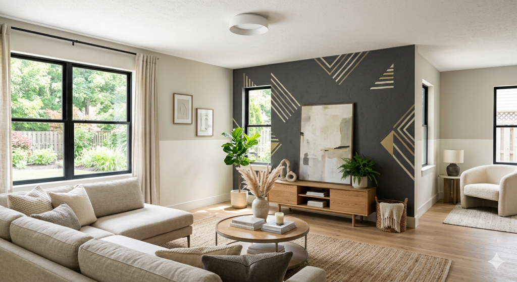
Interior painting ideas for home projects range from simple single-color updates to creative techniques like accent walls, ombré effects, and geometric patterns. The best approach depends on your room size, natural light, existing furniture, and personal style preferences. Popular options include neutral palettes for timeless appeal, bold accent walls for visual interest, two-tone walls for added dimension, and textured finishes for unique character. Proper surface preparation, quality paint selection, and strategic color placement create professional results that enhance your space’s functionality and aesthetic appeal while staying within budget. Refreshing your living space doesn’t always require a complete renovation. Sometimes, a fresh coat of paint in the right color or pattern can completely transform how a room feels and functions. From choosing complementary shades to experimenting with modern techniques, the possibilities are endless when you explore different interior painting ideas for home makeovers. Whether you’re working with a small bedroom or an expansive living area, understanding which colors work best in specific spaces helps you make informed decisions. This guide covers practical color selections, trending palettes, design rules, and professional techniques that deliver stunning results for Canadian homeowners. Why Interior Painting Ideas for Home Matter Choosing the right interior painting ideas for home projects affects more than just appearance. Color influences mood, perceived room size, and even property value. A well-planned paint scheme creates cohesion between rooms while allowing each space to serve its intended purpose. Paint is one of the most cost-effective ways to update your home. Compared to replacing flooring or purchasing new furniture, a professional paint job delivers dramatic change without breaking the budget. The right colors make small rooms feel larger, dark spaces feel brighter, and outdated homes feel current. Different rooms require different approaches. Kitchens benefit from colors that feel clean and energizing, while bedrooms need calming tones that promote rest. Living rooms often use neutral bases that accommodate changing decor, and bathrooms work well with moisture-resistant paint in refreshing shades. Understanding color psychology helps you select shades that support each room’s function. Blues and greens promote relaxation, making them ideal for bedrooms. Yellows and oranges stimulate conversation and appetite, working well in dining areas. Grays and beiges provide versatile backgrounds that never go out of style. Professional execution matters just as much as color selection. Proper surface preparation, quality materials, and skilled application create finishes that last years without peeling or fading. True Coat’s experienced team handles every detail, from protecting your furniture to ensuring crisp, clean lines that showcase your chosen interior painting ideas for home perfectly. What Is the Best Color to Paint Inside Your House? The best interior color depends on your specific needs, but neutral tones like soft gray, warm beige, and creamy white consistently deliver excellent results across different spaces and design styles. Neutral colors provide flexibility. They pair well with various furniture styles, artwork, and accent pieces. When you redecorate or change accessories, neutral walls don’t clash with new choices. This versatility makes neutrals practical for homeowners who like updating their decor periodically. Light neutrals make rooms feel larger and brighter. In Canadian homes where winter months bring limited daylight, lighter wall colors reflect available light and prevent spaces from feeling dark or cramped. Soft whites and pale grays work particularly well in north-facing rooms that receive less natural light. Warm neutrals like beige, taupe, and greige (gray-beige blend) create cozy atmospheres. These colors work beautifully in living rooms, bedrooms, and family spaces where comfort matters. They complement wood tones in flooring and furniture while maintaining a sophisticated appearance. Cool neutrals like soft gray and blue-gray suit modern aesthetics. These shades pair well with contemporary furniture, stainless steel appliances, and minimalist decor. They create calm, uncluttered environments that feel current and clean. Consider your home’s lighting when selecting neutrals. Paint samples on different walls and observe them throughout the day. Morning light, afternoon sun, and evening artificial light all affect how colors appear. What looks perfect at noon might seem too cool or too warm by evening. For those seeking guidance on selecting the perfect shade, professional color consultation services help you navigate options and choose colors that complement your home’s unique features. Popular Interior Painting Ideas for Home in 2026 Current interior painting ideas for home projects blend timeless appeal with fresh, contemporary touches. These trending approaches work well in Canadian homes and suit various budgets and skill levels. Accent Walls Accent walls remain one of the most popular interior painting ideas for home updates. This technique involves painting one wall in a bold or contrasting color while keeping other walls neutral. Accent walls draw attention to architectural features, create focal points, and add personality without overwhelming a space. Choose the wall behind your bed in a bedroom, the wall behind your sofa in a living room, or the wall featuring a fireplace. These natural focal points benefit from accent colors that highlight their importance in the room’s layout. Popular accent wall colors include deep navy, forest green, charcoal gray, and terracotta. These rich shades create drama and depth while remaining sophisticated. Pair them with white or light gray on remaining walls for balance. Two-Tone Walls Two-tone walls divide a single wall horizontally, using different colors on the top and bottom sections. This classic technique adds visual interest and can make ceilings appear higher or rooms feel more proportioned. Traditional applications place darker colors on the bottom portion (typically one-third of the wall height) with lighter shades above. This creates a grounding effect and hides scuffs in high-traffic areas. Modern interpretations sometimes reverse this, placing bold colors on top for unexpected visual impact. Chair rail molding often marks the division point, but painter’s tape creates clean lines without added trim. This approach works particularly well in dining rooms, hallways, and children’s rooms. Geometric Patterns Geometric patterns bring contemporary style to interior painting ideas for home projects. Triangles, hexagons, chevrons, and abstract shapes create custom wall art without the cost of wallpaper or professional murals. These patterns work