Interior painting ideas for home projects range from simple single-color updates to creative techniques like accent walls, ombré effects, and geometric patterns. The best approach depends on your room size, natural light, existing furniture, and personal style preferences.
Popular options include neutral palettes for timeless appeal, bold accent walls for visual interest, two-tone walls for added dimension, and textured finishes for unique character.
Proper surface preparation, quality paint selection, and strategic color placement create professional results that enhance your space’s functionality and aesthetic appeal while staying within budget.
Refreshing your living space doesn’t always require a complete renovation. Sometimes, a fresh coat of paint in the right color or pattern can completely transform how a room feels and functions.
From choosing complementary shades to experimenting with modern techniques, the possibilities are endless when you explore different interior painting ideas for home makeovers.
Whether you’re working with a small bedroom or an expansive living area, understanding which colors work best in specific spaces helps you make informed decisions. This guide covers practical color selections, trending palettes, design rules, and professional techniques that deliver stunning results for Canadian homeowners.
Why Interior Painting Ideas for Home Matter
Choosing the right interior painting ideas for home projects affects more than just appearance. Color influences mood, perceived room size, and even property value. A well-planned paint scheme creates cohesion between rooms while allowing each space to serve its intended purpose.
Paint is one of the most cost-effective ways to update your home. Compared to replacing flooring or purchasing new furniture, a professional paint job delivers dramatic change without breaking the budget. The right colors make small rooms feel larger, dark spaces feel brighter, and outdated homes feel current.
Different rooms require different approaches. Kitchens benefit from colors that feel clean and energizing, while bedrooms need calming tones that promote rest. Living rooms often use neutral bases that accommodate changing decor, and bathrooms work well with moisture-resistant paint in refreshing shades.
Understanding color psychology helps you select shades that support each room’s function. Blues and greens promote relaxation, making them ideal for bedrooms. Yellows and oranges stimulate conversation and appetite, working well in dining areas. Grays and beiges provide versatile backgrounds that never go out of style.
Professional execution matters just as much as color selection. Proper surface preparation, quality materials, and skilled application create finishes that last years without peeling or fading. True Coat’s experienced team handles every detail, from protecting your furniture to ensuring crisp, clean lines that showcase your chosen interior painting ideas for home perfectly.
What Is the Best Color to Paint Inside Your House?
The best interior color depends on your specific needs, but neutral tones like soft gray, warm beige, and creamy white consistently deliver excellent results across different spaces and design styles.
Neutral colors provide flexibility. They pair well with various furniture styles, artwork, and accent pieces. When you redecorate or change accessories, neutral walls don’t clash with new choices. This versatility makes neutrals practical for homeowners who like updating their decor periodically.
Light neutrals make rooms feel larger and brighter. In Canadian homes where winter months bring limited daylight, lighter wall colors reflect available light and prevent spaces from feeling dark or cramped. Soft whites and pale grays work particularly well in north-facing rooms that receive less natural light.
Warm neutrals like beige, taupe, and greige (gray-beige blend) create cozy atmospheres. These colors work beautifully in living rooms, bedrooms, and family spaces where comfort matters. They complement wood tones in flooring and furniture while maintaining a sophisticated appearance.
Cool neutrals like soft gray and blue-gray suit modern aesthetics. These shades pair well with contemporary furniture, stainless steel appliances, and minimalist decor. They create calm, uncluttered environments that feel current and clean.
Consider your home’s lighting when selecting neutrals. Paint samples on different walls and observe them throughout the day. Morning light, afternoon sun, and evening artificial light all affect how colors appear. What looks perfect at noon might seem too cool or too warm by evening.
For those seeking guidance on selecting the perfect shade, professional color consultation services help you navigate options and choose colors that complement your home’s unique features.
Popular Interior Painting Ideas for Home in 2026
Current interior painting ideas for home projects blend timeless appeal with fresh, contemporary touches. These trending approaches work well in Canadian homes and suit various budgets and skill levels.
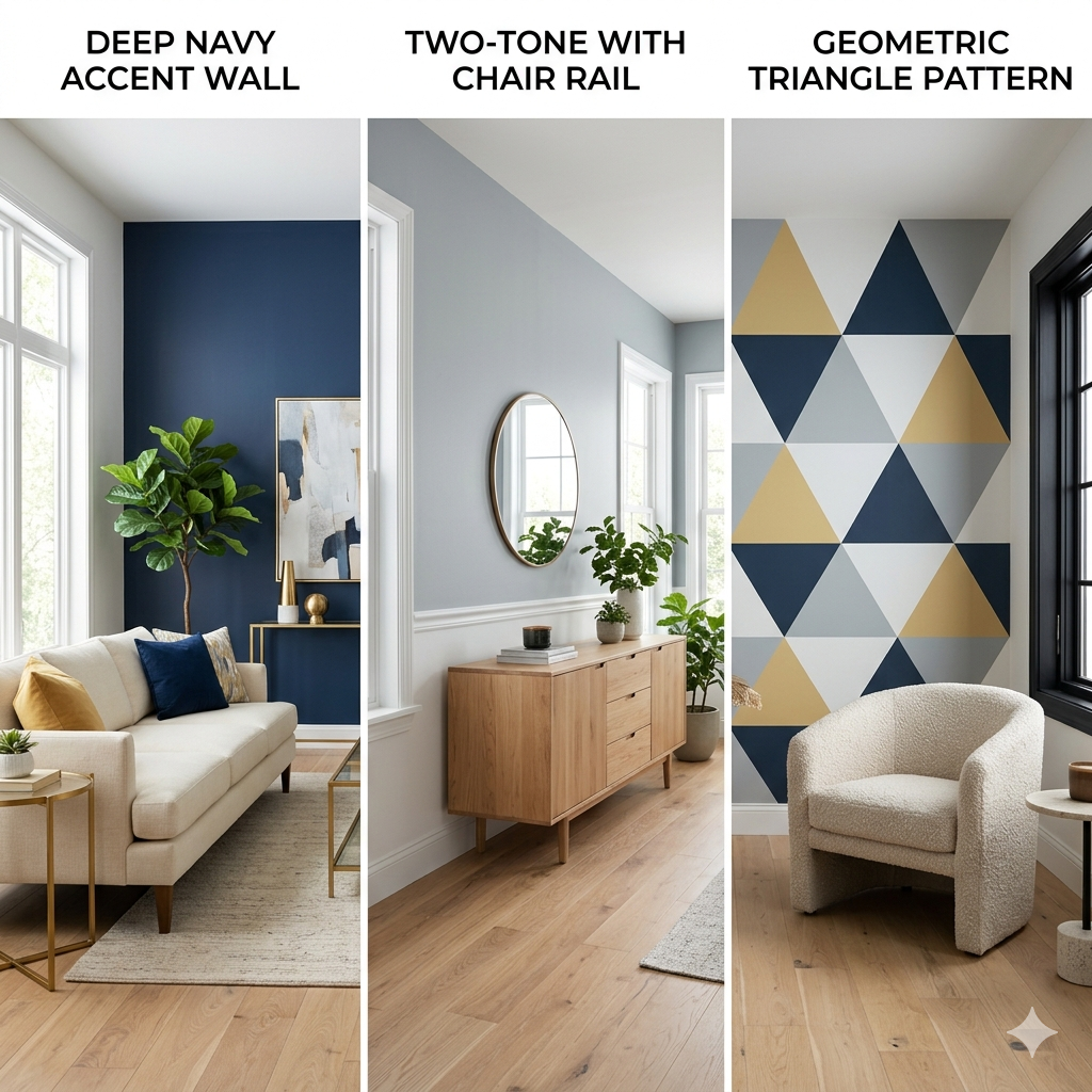
Accent Walls
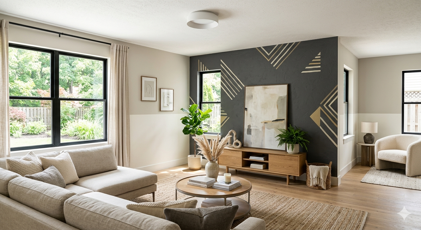
Accent walls remain one of the most popular interior painting ideas for home updates. This technique involves painting one wall in a bold or contrasting color while keeping other walls neutral. Accent walls draw attention to architectural features, create focal points, and add personality without overwhelming a space.
Choose the wall behind your bed in a bedroom, the wall behind your sofa in a living room, or the wall featuring a fireplace. These natural focal points benefit from accent colors that highlight their importance in the room’s layout.
Popular accent wall colors include deep navy, forest green, charcoal gray, and terracotta. These rich shades create drama and depth while remaining sophisticated. Pair them with white or light gray on remaining walls for balance.
Two-Tone Walls
Two-tone walls divide a single wall horizontally, using different colors on the top and bottom sections. This classic technique adds visual interest and can make ceilings appear higher or rooms feel more proportioned.
Traditional applications place darker colors on the bottom portion (typically one-third of the wall height) with lighter shades above. This creates a grounding effect and hides scuffs in high-traffic areas. Modern interpretations sometimes reverse this, placing bold colors on top for unexpected visual impact.
Chair rail molding often marks the division point, but painter’s tape creates clean lines without added trim. This approach works particularly well in dining rooms, hallways, and children’s rooms.
Geometric Patterns
Geometric patterns bring contemporary style to interior painting ideas for home projects. Triangles, hexagons, chevrons, and abstract shapes create custom wall art without the cost of wallpaper or professional murals.
These patterns work best as accent features on single walls. Use painter’s tape to create sharp, clean lines between colors. Choose two or three complementary colors for cohesive designs that don’t feel chaotic.
Geometric patterns suit modern homes and contemporary spaces. They add personality to home offices, playrooms, and teen bedrooms while remaining paintable when tastes change.
What Are the New Interior Colors for 2026?
Interior colors for 2026 emphasize warm, earthy tones, soft pastels, and bold jewel shades that create comfortable, personalized spaces.
Earthy Tones
Warm browns, terracotta, clay, and rust bring natural warmth into homes. These colors connect interior spaces with outdoor environments and create grounding, comfortable atmospheres. They pair beautifully with natural materials like wood, stone, and woven textiles.
Terracotta works particularly well in kitchens and dining areas, adding warmth without feeling too bold. Clay and rust shades suit living rooms and bedrooms, creating cozy retreats that feel inviting year-round.
Soft Pastels
Gentle pastels like blush pink, soft sage, powder blue, and buttery yellow offer subtle color without overwhelming spaces. These shades work well in bedrooms, bathrooms, and nurseries where calm, soothing environments matter.
Unlike the bright pastels of previous decades, current versions appear muted and sophisticated. They pair well with white trim and natural wood tones, creating spaces that feel fresh and timeless rather than trendy.
Jewel Tones
Deep emerald green, sapphire blue, amethyst purple, and ruby red bring luxury and drama to interior painting ideas for home projects. These rich, saturated colors work best as accents or in rooms with ample natural light.
Emerald green creates striking accent walls in living rooms and dining spaces. Sapphire blue suits bedrooms and home offices, promoting focus and calm. Use these bold shades sparingly for maximum impact.
Those interested in exploring unique finish options might consider limewash painting techniques that add texture and depth to these trending colors.
What Is the 3 Color Rule in Interior Design?
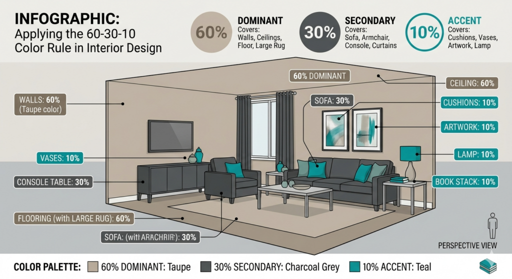
The 3 color rule suggests using three colors in a 60-30-10 ratio throughout a room: 60% dominant color, 30% secondary color, and 10% accent color.
This formula creates balanced, cohesive spaces that feel intentionally designed rather than randomly decorated. The dominant color typically appears on walls, the secondary color shows up in upholstery and larger furniture pieces, and the accent color appears in accessories and small decor items.
Dominant Color (60%): This color covers the majority of your space, usually walls and large furniture pieces. Neutrals work best here because they provide a versatile foundation. Soft gray, beige, or white allows flexibility with secondary and accent colors.
Secondary Color (30%): This color appears in medium-sized elements like curtains, area rugs, bedding, or upholstered furniture. It should complement your dominant color while adding visual interest. If your walls are soft gray, your secondary color might be navy blue or sage green.
Accent Color (10%): This color provides pops of interest through throw pillows, artwork, vases, and small decorative items. Accent colors can be bold and vibrant since they appear in limited quantities. A room with gray walls and navy upholstery might use coral or mustard yellow accents.
The 3 color rule keeps spaces from feeling chaotic while preventing them from appearing too monotonous. It provides enough variety to create interest without overwhelming the eye with too many competing shades.
Apply this rule when planning interior painting ideas for home projects. Choose your wall color first (dominant), then select complementary shades for furniture and accents. This systematic approach ensures your paint color works harmoniously with your overall design scheme.
Which Color Is Best for Interiors?
The best interior color varies by room function, but versatile options include soft gray for living spaces, warm white for kitchens, pale blue for bedrooms, and light sage for bathrooms.
Living Rooms
Living rooms benefit from neutral bases that accommodate changing decor and varied activities. Soft gray provides a modern foundation that pairs well with both warm and cool accent colors. Greige (gray-beige) offers warmth while maintaining contemporary appeal. These shades work with leather and fabric furniture, traditional and modern styles, and seasonal decorating changes.
Kitchens
Kitchens need colors that feel clean, bright, and energizing. Warm white creates a fresh backdrop that makes the space feel larger and helps you see what you’re cooking. Soft yellow adds cheerfulness without being overwhelming. Light gray with cool undertones pairs beautifully with stainless steel appliances and creates a modern, sophisticated look.
For professional kitchen updates, explore kitchen cabinet painting services that coordinate with your wall color choices.
Bedrooms
Bedrooms require calming colors that promote relaxation and sleep. Pale blue reduces stress and lowers blood pressure, making it ideal for rest. Soft lavender combines calming blue with warm red, creating a soothing yet cozy atmosphere. Light sage green brings nature indoors and pairs well with wood furniture.
Bathrooms
Bathrooms work well with colors that feel clean and spa-like. Light aqua creates a fresh, coastal feeling. Soft gray maintains a neutral backdrop that accommodates changing towels and accessories. Pale mint offers a subtle color that feels both clean and calming.
Home Offices
Home offices need colors that promote focus and productivity. Navy blue stimulates concentration without feeling cold. Warm gray creates a professional atmosphere that doesn’t distract. Soft green reduces eye strain and promotes balanced, steady work.
Different spaces throughout your home benefit from coordinated color schemes that create flow while allowing each room to serve its purpose. For comprehensive guidance on selecting and applying these colors, consider working with experienced interior painters who understand how colors interact with lighting and architecture.
What Colors Make a House Look Expensive?
Colors that make a house look expensive include deep charcoal gray, rich navy blue, warm taupe, soft sage, and crisp white with contrasting trim.
Deep Charcoal Gray
Charcoal gray creates sophisticated, modern spaces that feel high-end and intentional. This color works particularly well in dining rooms, home offices, and master bedrooms. Pair it with white trim and metallic accents for maximum impact. The contrast between dark walls and bright trim creates architectural interest that elevates the entire space.
Rich Navy Blue
Navy blue brings classic elegance to any room. This timeless color appears in luxury homes and high-end hotels because it feels both bold and refined. Use navy on accent walls or in smaller rooms like powder bathrooms where the dramatic color won’t overwhelm. Pair with brass or gold fixtures for an upscale look.
Warm Taupe
Taupe offers understated luxury that never goes out of style. This neutral shade appears more expensive than basic beige because it contains complex undertones that change with lighting. Taupe works throughout the home, creating cohesive flow between rooms while maintaining sophistication.
Soft Sage
Sage green brings natural elegance indoors. This muted green shade feels expensive because it’s less common than standard neutrals while remaining versatile and timeless. Sage pairs beautifully with natural wood, marble, and brass, materials associated with luxury design.
Crisp White with Contrast
Pure white walls with dark or colorful trim create high-contrast looks found in designer homes. This combination makes architectural details stand out and gives rooms a custom, finished appearance. Use bright white on walls with black, navy, or charcoal trim for striking results.
Quality paint finish matters as much as color selection. Matte finishes on walls look more expensive than high-gloss options, which can highlight imperfections. Reserve satin or semi-gloss finishes for trim and doors where they create subtle contrast and are easier to clean.
Professional preparation and application create the flawless finishes that signal quality. Proper surface preparation and skim coating eliminate imperfections that detract from even the most beautiful paint colors.
Creative Techniques for Interior Painting Ideas for Home
Beyond solid colors, creative painting techniques add texture, depth, and personality to interior painting ideas for home projects.
Ombré Walls
Ombré creates gradual color transitions from dark to light or between two related shades. This technique adds visual interest and makes ceilings appear higher. Start with the darkest shade at the bottom, gradually blending lighter tones as you move upward. Ombré works beautifully in bedrooms and nurseries, creating calming, artistic environments.
Stripes
Vertical stripes make ceilings appear higher, while horizontal stripes make rooms feel wider. Use painter’s tape to create clean, even lines. Alternate between two shades of the same color for subtle sophistication, or choose contrasting colors for bold impact. Stripes work well in children’s rooms, hallways, and bathrooms.
Sponging
Sponging adds texture and depth by layering colors with a natural sea sponge. Apply a base coat, let it dry, then dab a lighter or darker shade over it with the sponge. This technique hides wall imperfections and creates visual interest without overwhelming patterns. Sponging suits traditional and transitional design styles.
Color Blocking
Color blocking divides walls into distinct sections of solid color, creating modern, graphic looks. Unlike two-tone walls with horizontal divisions, color blocking uses vertical or irregular sections. This bold technique works well in contemporary homes and creates custom art installations without additional expense.
Stenciling
Stencils allow you to add patterns without wallpaper’s commitment or cost. Create repeating patterns across entire walls or use stencils to add decorative borders near ceilings or floors. Moroccan patterns, floral designs, and geometric shapes are popular choices that add personality to plain walls.
Practical Tips for Implementing Interior Painting Ideas for Home
Successfully executing interior painting ideas for home requires proper planning, preparation, and technique.
Surface Preparation
Clean walls thoroughly before painting. Remove dirt, grease, and dust with a mild detergent solution. Fill holes and cracks with spackle, then sand smooth once dry. Proper preparation ensures paint adheres correctly and creates professional results.
Damaged walls benefit from professional drywall repair services before painting begins. Fixing underlying issues prevents future problems and creates flawless finishes.
Quality Materials
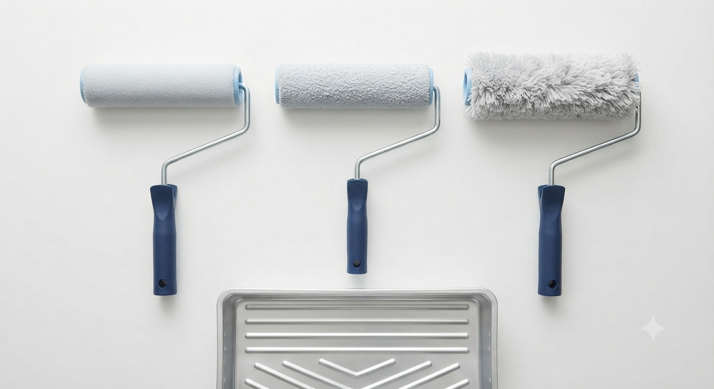
Invest in quality paint and supplies. Premium paints cover better, last longer, and deliver richer colors than budget options. They often require fewer coats, saving time and effort. Quality brushes and rollers apply paint more evenly and don’t shed fibers into wet paint.
Proper Technique
Use painter’s tape to protect trim, ceilings, and adjacent walls. Apply paint in thin, even coats rather than trying to cover in one thick application. Allow proper drying time between coats. Roll in W patterns to distribute paint evenly and prevent roller marks.
Lighting Considerations
Test paint colors in your actual space before committing. Paint large swatches on different walls and observe them throughout the day. Morning light, afternoon sun, and evening artificial light all affect how colors appear. What looks perfect in the store might seem too dark, too bright, or the wrong undertone in your home.
Professional Assistance
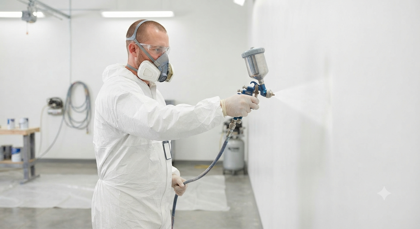
Complex projects benefit from professional expertise. Intricate techniques, large spaces, and rooms with high ceilings are easier and safer when handled by experienced painters. Professionals complete projects faster and deliver cleaner, more polished results than most DIY efforts.
True Coat brings years of experience to every project, ensuring your interior painting ideas for home are executed flawlessly. Our team handles preparation, application, and cleanup, delivering beautiful results without the stress of DIY painting. Contact us for a free estimate on your next painting project.
Things to Know About Interior Painting Ideas for Home
Paint Sheen Matters: Different finishes serve different purposes. Flat or matte finishes hide imperfections but are harder to clean. Eggshell and satin offer moderate durability and subtle shine. Semi-gloss and gloss work well on trim and doors where easy cleaning matters.
Sample Before Committing: Always test paint samples before purchasing full gallons. Colors look different on large surfaces than on small chips. Live with samples for several days to ensure you’re satisfied in all lighting conditions.
Ventilation Is Essential: Proper airflow during and after painting helps paint dry correctly and removes fumes. Open windows and use fans to circulate air. Consider low-VOC or zero-VOC paints for healthier indoor air quality, especially in bedrooms and children’s rooms.
Timing Affects Results: Paint in moderate temperatures and humidity levels. Extreme heat, cold, or moisture affects how paint applies and dries. Spring and fall typically offer ideal painting conditions in Winnipeg.
Color Affects Temperature Perception: Warm colors (reds, oranges, yellows) make spaces feel warmer, while cool colors (blues, greens, purples) create cooler sensations. Consider your climate and heating costs when selecting colors.
Coordination Creates Flow: While each room can have its own color, maintaining some connection between spaces creates cohesive flow. Use variations of the same neutral, repeat accent colors, or keep trim and ceiling colors consistent throughout.
For expert guidance on selecting colors and executing your vision, explore residential painting services that transform houses into homes.
Wrapping Up Your Interior Painting Project
Interior painting ideas for home projects offer endless possibilities for transforming your living space. From choosing the perfect neutral base to experimenting with bold accent walls, the right colors and techniques create environments that reflect your personality and support your lifestyle.
Understanding color psychology, design rules, and current trends helps you make informed decisions that you’ll love for years. Whether you prefer timeless neutrals or bold jewel tones, proper planning and execution ensure beautiful, lasting results.
Professional painters bring expertise, efficiency, and quality that elevate any project. True Coat’s skilled team handles every detail, from protecting your furniture to ensuring crisp lines and flawless finishes. We understand how color, light, and texture work together to create spaces that feel both beautiful and functional.
Ready to transform your home with fresh paint? Contact True Coat today for a free consultation and discover how the right interior painting ideas for home can completely change how you experience your space.
Frequently Asked Questions
What is the best color to paint inside your house?
Soft gray and warm beige are the best interior colors because they provide versatile, timeless foundations that work with various decor styles. These neutrals reflect light well, make rooms feel larger, and pair beautifully with both warm and cool accent colors. They also maintain their appeal over time, unlike trendy shades that may feel dated quickly.
What are the new interior colors for 2026?
Earthy tones, soft pastels, and jewel tones dominate 2026 color trends. Terracotta, clay, and rust bring warmth, while muted sage, blush, and powder blue offer subtle sophistication. Deep emerald, sapphire, and amethyst create dramatic accents. These colors emphasize natural, comfortable spaces that feel personalized and grounding.
What is the 3 color rule in interior design?
The 3 color rule uses a 60-30-10 ratio for balanced room design. Apply your dominant color to 60% of the space (usually walls), your secondary color to 30% (furniture and larger items), and your accent color to 10% (decorative accessories). This formula creates cohesive, intentionally designed spaces without visual chaos.
Which color is best for interiors?
The best interior color depends on room function. Living rooms benefit from soft gray or greige, kitchens work well with warm white or light gray, bedrooms need calming pale blue or lavender, and bathrooms suit light aqua or soft gray. Each space requires colors that support its intended use and create appropriate atmospheres.
What colors make a house look expensive?
Deep charcoal, rich navy, warm taupe, and crisp white with contrast trim create expensive-looking interiors. These sophisticated colors appear in luxury homes because they feel intentional and refined. Pair them with quality finishes, proper preparation, and professional application for maximum impact that signals thoughtful design investment.