What Are the Best Interior Paint Colors for House Projects?
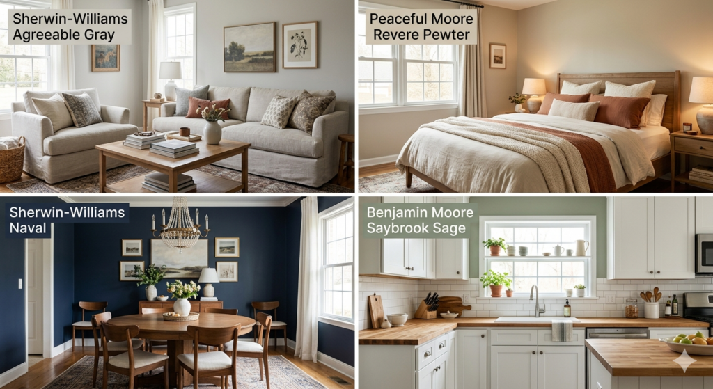
Interior paint colors for house projects can completely transform your living space from ordinary to extraordinary. Neutral tones like warm whites, soft grays, and beiges remain timeless favorites because they work with almost any decor style. Bold accent walls in navy, emerald, or terracotta add personality without overwhelming rooms. Light colors make small spaces feel larger, while darker shades create cozy environments. The 60-30-10 color rule helps balance dominant, secondary, and accent colors for professional results. Popular trends include earthy greens, warm taupes, and calming blues that bring nature indoors. Your choice should reflect your lifestyle, the room’s purpose, and how much natural light enters the space. What Is the Best Color for the Interior of a House? The best interior paint colors for house spaces depend on room function, natural light, existing furniture, and personal preferences. Warm whites and soft grays create clean backdrops that adapt to different rooms, reflect light beautifully, and make spaces feel open. For living rooms, warm neutrals like greige create welcoming environments. These interior paint colors for house common areas pair well with traditional and modern furniture. Bedrooms benefit from calming shades. Soft blues, gentle lavenders, and muted greens promote relaxation and better sleep, creating peaceful retreats. Kitchens work well with fresh colors. White makes spaces feel sanitary and bright. Light gray and soft sage green add personality while maintaining freshness. Bathrooms handle both light and bold choices. Crisp white creates spa-like feels, while deeper blues or greens add sophistication. How Natural Light Affects Your Color Choice Natural light dramatically changes how interior paint colors for house rooms appear. North-facing rooms receive cooler light making colors appear more blue or gray. Use warm tones like peach, cream, or warm beige here. South-facing rooms get abundant warm sunlight that intensifies colors. Cooler shades like soft grays, blues, or greens work well because natural light adds warmth. East-facing rooms receive bright morning light shifting to cooler afternoon tones, making versatile neutrals ideal. Test paint samples on your walls and watch how they look at different times of day before committing to interior paint colors for house projects. What Are Good Interior Paint Colors? Good interior paint colors for house transformations combine aesthetic appeal with practical functionality. Warm whites provide a clean, timeless look. Greige tones offer warmth without starkness. Soft blues bring calmness and serenity, reducing anxiety and promoting better sleep. Warm earth tones connect indoor spaces with nature. Terracotta, warm taupe, and clay create cozy environments perfect for living rooms and dining rooms. Green has become increasingly popular for interior paint colors for house projects. Sage, olive, and eucalyptus bring the outdoors in while maintaining sophistication. Top Color Pairings Navy blue creates dramatic focal points on accent walls or rooms with abundant natural light. Navy pairs beautifully with gold accents and natural wood tones. Charcoal gray adds sophistication without heaviness, working well in modern homes with white trim. What Is the 3 Color Rule in Interior Design? The 3 color rule, also known as the 60-30-10 rule, creates balanced, harmonious spaces. This guideline helps you distribute interior paint colors for house rooms in proportions that look intentional. Use 60% dominant color (typically walls), 30% secondary color (upholstery, curtains, furniture), and 10% accent color (accessories, throw pillows, artwork). For interior paint colors for house applications, walls represent the 60%. Your secondary color appears in sofas or area rugs. Accent colors show in throw pillows or vases. In bedrooms, choose pale blue walls (60%), cream bedding (30%), and soft coral accents (10%). Dining rooms could feature warm beige walls (60%), wood dining table (30%), and emerald green table settings (10%). Home offices might use sage green walls (60%), white furniture (30%), and brass hardware (10%). The rule is flexible. The key is maintaining balance so one color dominates, another supports, and a third adds interest. What Is the Most Popular Interior Paint Color Right Now? The most popular interior paint colors for house projects lean toward warm, earthy neutrals and nature-inspired shades reflecting comfort and connection to nature. Warm whites dominate as the go-to choice. Shades with creamy undertones create inviting spaces that feel fresh without coldness. Greige remains incredibly popular, blending gray and beige for sophistication with warmth. Earthy greens have surged in popularity. Sage, olive, and eucalyptus bring the outdoors inside while creating calming spaces. These interior paint colors for house bedrooms and living rooms reflect growing interest in nature-inspired design. Warm terracotta and clay tones create cozy spaces. These reddish-brown shades add warmth without being overly bold. In Winnipeg and across Canada, interior paint colors for house projects often reflect the local climate. Warm, cozy colors balance long, cold winters. True Coat serves Winnipeg homeowners with expert color consultation to help choose colors that suit your home. Current trends also include deeper, moodier colors. Navy blue, forest green, and charcoal create drama while feeling sophisticated. If you’re considering residential painting in Winnipeg, these warmer interior paint colors for house projects will keep your home looking current. What Color Makes a House Look Expensive? Certain interior paint colors for house projects instantly elevate spaces. Deep, rich neutrals like charcoal, deep taupe, and warm chocolate brown create luxurious backdrops that make furnishings pop. True white with warm undertones looks more expensive than stark, cool white. Creamy whites feel deliberate and curated, creating gallery-like quality in interior paint colors for house walls. Navy blue exudes sophistication in traditional and modern homes. Use it in dining rooms or as accent walls. Soft, muted colors like dusty pink, sage green, or soft lavender in powder rooms show attention to detail. Application Techniques That Add Luxury Paint finish affects how expensive your interior paint colors for house projects appear. Matte or flat finishes look sophisticated and hide imperfections. Eggshell or satin finishes strike a balance between elegance and durability with subtle sheen. Proper preparation makes any color look expensive. True Coat’s skim coating services create perfectly smooth surfaces. Monochromatic schemes using different shades create sophisticated spaces. High contrast between